- Joined
- May 3, 2025
- Messages
- 433
- Level up in
- 67 posts
- Reaction score
- 5,075
- Points
- 2,077
- Location
- Indiana
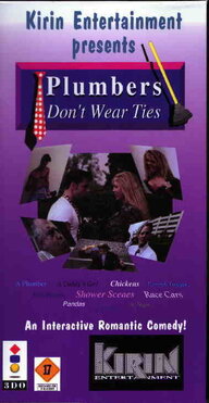
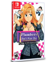
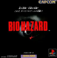
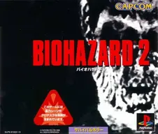
Show me Japanese box art that you think is superior to the USA box art with images of course

Wow they thought "Americans will love this box art because they love to get high" lololol.
Are you aware that virtually 99% of the games will be posted here? lolShow me Japanese box art that you think is superior to the USA box art with images of course
YeahAre you aware that virtually 99% of the games will be posted here? lol
I will give you one then. This is pure joy:Yeah
Post automatically merged:
I was gonna post the USA box art but the Japanese box art for Mickey racing USA is PK FIREView attachment 73441


")