Worst redesigns in gaming

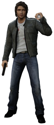
That guy doesn't come even close to what Simon Belmont went through

View attachment 64692View attachment 64693
Technically speaking the latter is closer to Simon Belmont as he appears in the instruction manual with the Short Red hair (the "real" Simon as some snobs like to claim):
tumblr_n3nwob8TfZ1tu022ro1_500.png


Also the image you are using form "Classic" Simon comes from Grimoire of Souls, which uses the same design as Simon in Smash Ultimate due to brand synergy (Notice how every appereance from that game onward uses said look)

The Barbarian Simon as seen in the Cover of CV1 was first used in-game proper via Haunted Castle and fully canonized in the Sharp X68000 remake of Castlevania............only to be redesigned AGAIN with Chronicles for the PS1, which i still believe to be one of the worst redesigns of any game character and the worst design by the otherwise talented Ayami Kojima.

I could go and make a huge essay video about every design Simon has went through, but don't mistake this fact-check as me saying Judgement or Chronicles Simon designs are good, they SUCK. It's just that Simon's history is far more complicated than people give it credit for.
 
Last edited:
That guy doesn't come even close to what Simon Belmont went through

View attachment 64692View attachment 64693
You guys are tweaking with this, the Castlevania Judgement designs are pure fire. Honestly, the one in the thread post is fire as fuck too. People are too scared of different iterations or alternate timeline designs. Yeah, OG Simon is my favourite and I prefer it over Judgement's design, but you're crazy as hell if you think that's a bad redesign. Its dope as hell.
Post automatically merged:

Example of actual dogshit redesign, this and Donte.
 
You guys are tweaking with this, the Castlevania Judgement designs are pure fire. Honestly, the one in the thread post is fire as fuck too. People are too scared of different iterations or alternate timeline designs. Yeah, OG Simon is my favourite and I prefer it over Judgement's design, but you're crazy as hell if you think that's a bad redesign. Its dope as hell.
Post automatically merged:


Example of actual dogshit redesign, this and Donte.
Hard disagree. All of the character designs in Judgement are awful except for the OC Aeon, and even then he pales (heh) in comparison to Ayami Kojima-original characters like Leon and Hector who are far more eye catching. The Judgement character outfits are unappealing and overly exaggerated (even by Castlevania standards) and the fact that some of them look like Death Note characters doing cosplay makes them look dumber.

Also "YoU JuST don'T LikE ChaNGE" is an observation, not an actual argument. If you are gonna make such heavy changes to a character with an established look, there's a point you might as well make a new protagonist instead if you want something unrecognizable. Also Donte is not that bad of a redesign, he is just missing the Iconic White Hair.
 
Last edited:
Regarding Donte - every time I see that exterminador de demonios, this image of Tameem Antoniades, infamous prick and director of DmC: DMC comes to mind.
https://i.imgur.com/4hcty4T.jpeg

Which, you know... sure is a choice you can make when designing the look of the "cool guy" protagonist of the game you're directing.
 
You guys are busy arguments about castlevania or something completely forgetting one of the biggest crimes in gaming history.... The red alert 3 artstyle and it's consequences on red alert

Look how they massacred my communist boys

The iron curtain in red alert 1:
CNCRA_Iron_Curtain.png

Looks basic

The curtain in 2:
Passive_Iron_Curtain_in_Tempearte_Theater.jpg

Looks like a natural evolution then RA3 iron curtain and oh god....

Iron_Curtain.jpg

????? All the cool factor GONE

The soviet conscripts looked rad in 2

RA2_Conscripts.png

(FOR MOTHER RUSSIA!)

THEN RA3 came around and turned them into this stupid twat with oversized AK
RA3_Conscript.jpg


And finally my beloved apocalypse tank... Here it is in Red alert 2

RA2_Apocalypse_Tank.png


And here is its shitty version in 3 THEY REMOVED THE ANTI AIR MISSILE LAUNCHERS LIKE WTF MAN?

RA3_Apocalypse_Tank.png

Look at this bloated mess with sluggish looks compared to the clean and nice grounded looks of 2 oh my god it's such a disaster that befell the CNC games only acceptable design of RA3 in terms of units is the tesla trooper.

Now don't get me wrong to offset the shitting on the artstyle above here is some images FROM RA3 promotional art etc:

Conscript_RA3.jpg

Bro looks really good on paper....

pvsn3i6pjls91.jpg
Japanese victory screen

Ra3_propaganda.png
soviet victory screen

5bbcc9afaf0249cc9eac4525903f28a7.jpg

Looks good yeah?

Here is the only good looking guys in RA3 the tesla troopers

RA3_Tesla_Troopers.jpg

Yeah they are present in the image above this one too


For comparison here is RA2 art

Red-Alert-2-art.jpg
I'M COMING TO GET YOU

891413e531b8b1df1c8a36d35705482d.jpg

This is how guys want to look like peak male fantasy.

RA2_Tesla_Trooper.png

Zappi boy in game
 
Last edited:
Also "YoU JuST don'T LikE ChaNGE" is an observation, not an actual argument. If you are gonna make such heavy changes to a character with an established look, there's a point you might as well make a new protagonist instead if you want something unrecognizable.
May as well be a new protagonist, it's a spinoff fighting game. If you think Donte is fine I don't see why this isn't. Donte is missing white hair, the red coat (yes it's red inside but that isn't the point), he has that ugly wifebeater on. Donte resembles the new Nero more than anything, which actually I really like honestly. But yeah, alternate universe, you have to really put into consideration the setting of the entire game, would OG Simon FIT into this new setting and aesthetic? No. I guess that contradicts my Donte point lol, maybe I just don't like Donte much :loldogin the end I am what I hate.
 
Also "YoU JuST don'T LikE ChaNGE" is an observation, not an actual argument. If you are gonna make such heavy changes to a character with an established look, there's a point you might as well make a new protagonist instead if you want something unrecognizable. Also Donte is not that bad of a redesign, he is just missing the Iconic White Hair.
While I like being open to the idea of redesigns (sometimes), and I often find them amusing anyway even if it's just to laugh at it, what truly bothers me in this game is the fact that we could've got a Castlevania fighting game with an actual recognizable cast instead. But that doesn't mean I think some of those redesigns are bad on their own.
 
May as well be a new protagonist, it's a spinoff fighting game.
By that logic we might as well turn Mario into a albino goblin with a Blue hat in Mario Kart then. Mario Kart is a spin-off of Super Mario Bros, yet most appereances of Mario you can tell it's Mario by looking at him. Wheter be Red Overalls, Popeye-looking face, Literally Flat as Paper or beign chubbier than usual, Mario is still Mario.

There's slight changes, and then there's beign completely unrecognizable.
 

Users who are viewing this thread

Connect with us

Featured Video

Gintama Rumble (VITA)

Latest Threads

Are Video Games Art ?

Do you all Consider Video Games a piece of Art that deserves Respect or do you see them just as...
Read more

Living the Pi Life, Chapter Two

Chapter Two: The Day the Laptop Died


Hello, again, reader!

Last time I wrote, I still hadn't...
Read more

GTA 6 Releasing May 2026, XBOX Increases Game Price & More

A small update that will surely interest many. Take a look and have fun.
Read more

Playstation sacks Sackboy

sack.jpg


End of an era. While I never cared for the way the LittleBigPlanet games played...
Read more

VBA vs mGBA

Which do you prefer for GBA emulation and why?
Read more

Online statistics

Members online
160
Guests online
205
Total visitors
365

Forum statistics

Threads
7,399
Messages
184,554
Members
535,613
Latest member
okasuka

Support us

Back
Top