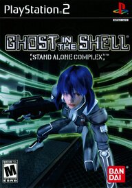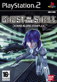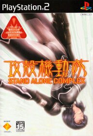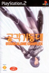
Regional Box Art and Title Changes

You should've been more specific. Your statement could have applied almost any post here with picture comparisons.

If I dont reply to a specific reply it means that im replying to what OP says
 
If I dont reply to a specific reply it means that im replying to what OP says
I am not psychic, so I am not going figure that out from the start. Though I'll try to remember for next time. Whenever the hell that will be.
 
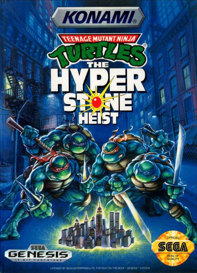
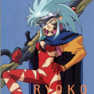
When both covers are awesome and bad ass for similar, yet different reasons! Not gonna lie though, Japan technically got the better cover, even though the USA version is more accurate to what is going in Hyperstone Heist.

21638_front.jpg


21637_front.jpg
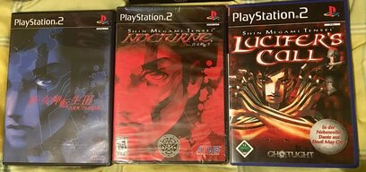
Nocturne is another case of both covers being awesome. The European one is the meh one this time. Only thing that has going for it is the new title, which sounds like a black metal album. Yes, that is where the "FEATURING DANTE FROM DEVIL MAY CRY" meme comes from.
1000000834.jpg
I prefer the American box art. Blue doesn't fit the game quite as much. Could do without the obnoxious pentagram that seems to only be there for edge points, though. I get it's for branding, but the thing is already on the spine.

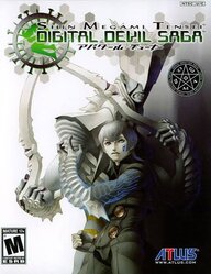
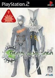
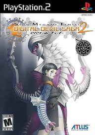
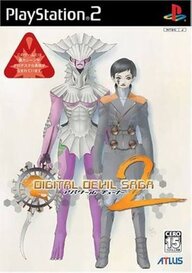
Digital Devil Saga has a rare case of the American box art being better than the Japanese. I sometimes pull my copies out just to admire the art.
1000000838.jpg1000000835.jpg
1000000837.jpg1000000836.jpg
 
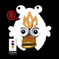
There's a specific flavor of this I've noticed, mainly with 5th-gen titles, where the original JP box art would be hand-drawn 2D artwork but the NA box art would be 3D renders, often with varying levels of uncanny valley. Anything 2D being dated was the zeitgeist in gaming at the time, so I suppose branding thought this should extend to the box art.

Two examples off the top of my head:
NA:
1771360469000.png

JP:
1771360489534.png
NA:
1771360577969.png

JP:
1771360603536.png
 
The thing is: Stupid American consumers deserve the bad box art. That's what they bought.

John Marketing didn't arbitrarily decide one day that Kirby needed to be angry to sell. They didn't just take a guess that people would want the ActionMan with the gun instead of the smiling blob.
They looked at the data.

The data showed that no one was buying cute hand drawn anime box art games. Little Timmy 90s was begging Mom and Dad to buy the game with the 3D render of Duke Nukem smoking a cigar and waving a Deagle on it.
Little American boys didn't want KeroKero's Rainbow Parade unless it got changed to SlaughterToad and the box showed him with a cool attitude.
 
And then they did it again..

I wonder if they ever would have tried doing it to another STG if they had the chance to.

EDIT:
1771364350060.png

The Original cover..

And then the bastardised cover is the EXACT SAME as the bastardised cover for Gunbird but with a 2 slapped on it. I am dead serious. And also not going to show it because it's literally the same too.

This is literally as if you published dodonpachi Dai-Ou-Jou as Battle Garegga 2.
Post automatically merged:

The thing is: Stupid American consumers deserve the bad box art. That's what they bought.

John Marketing didn't arbitrarily decide one day that Kirby needed to be angry to sell. They didn't just take a guess that people would want the ActionMan with the gun instead of the smiling blob.
They looked at the data.

The data showed that no one was buying cute hand drawn anime box art games. Little Timmy 90s was begging Mom and Dad to buy the game with the 3D render of Duke Nukem smoking a cigar and waving a Deagle on it.
Little American boys didn't want KeroKero's Rainbow Parade unless it got changed to SlaughterToad and the box showed him with a cool attitude.
Doesn't mean it needs to exist.. Just because people actually bought things like the juicero, doesn't mean they should exist, just because people bought shakeweights, doesn't mean they should exist.

Also clearly they don't actually know what people want, look at triple a publishers nowadays, do they look like they make games people want to play- NO! NO THEY DON'T!
 
Last edited:
Another example that just came to mind is Kollon, which got renamed to Ultimate Block Party in the US and given this treatment:
1771368473827.png

1771368526228.png


EU territories also got met with this to a degree, though they actually managed to come up with a title that stayed somewhat within the spirit of the original in Koloomn:
1771368748899.png


Also wild are those Imagine titles that Ubisoft published that actually turned out to be otome simulation games:
1771368917103.png

1771368933853.png


It honestly astounds me that this practice lasted well into the 2000s in the US.
 
Also wild are those Imagine titles that Ubisoft published that actually turned out to be otome simulation games:
View attachment 154964
View attachment 154965

It honestly astounds me that this practice lasted well into the 2000s in the US.
Apparently Midway just straight up published a CAVE made otome game in the EU, not providing the box because it doesn't fit the thread's theme but supposedly, they published it AFTER their bankruptcy. Anyways, might as well give shoutouts to the entire imagine series for basically republishing otome games in the west and probably being culprits of the genre being more popular here.
 
Tom DuBois freaking rules with the American Box Art. Some of them are not always 100% accurate, but they're eye catching and attention grabbing.

 
View attachment 144717
Look at the Japanese box art.
It's looks cute, doesn't it?
Looks something I'd want to play.
Meanwhile America
View attachment 144719
It's hideous.
I need to kill it with a flamethrower. And quickly to save us from the horrors of....... this thing that's pretending to be Tempo.
I’m a weirdo who prefers the US boxart because it looks like the cover of a heavy metal album
Post automatically merged:

Same here, but in this case, I think the US boxart fits the actual game a lot more. They’re even carrying pipes like in the actual game
 
I’m a weirdo who prefers the US boxart because it looks like the cover of a heavy metal album
Post automatically merged:


Same here, but in this case, I think the US boxart fits the actual game a lot more. They’re even carrying pipes like in the actual game
It is definitely beautiful in that American 90s 'cool' kind of way.
 
58263_front.jpg58265_front.jpg
58264_front.jpg700199_front.jpg
Ghost in the Shell: Stand Alone Complex
Koukaku Kidoutai: Stand Alone Complex
 
Much like its vast library of games across each region, the Super Nintendo is also home to some of the most iconic box arts in gaming history. However, there were slight differences between the designs of North American and PAL covers. While it's usually nothing TOO drastic, European covers often had colorful backgrounds compared to the black ones Americans received.:

K2.jpg

North America​
K1.jpg

Europe​
Y1.jpg

North America​
Y2.jpg

Europe​

For "Super Mario All-Stars" specifically, the PAL cover has these stars everywhere. In my opinion, it looks a lot nicer than the American cover.:

01 Super Mario All-Stars - USA Box Art.jpg

North America​
03 Super Mario All-Stars - PAL Box Art.jpg

Europe​

Which aesthetic do you guys prefer? Personally, I think they're both great in their own unique ways.
 
I tend to prefer the PAL ones too, but as you said the differences on SNES specifically usually aren't anything crazy, but the added color is nice. The uniformity with the NTSC ones are also good in their own right, but that "ONLY FOR" mark is kind of egregious and intrusive.
 
I think the gradient in the "only for" mark adds some charm to the overall thing. I also dislike how the flat colors on the PAL boxes don't connect to the bottom part at all.
 
I personally think they both look terrible, NA has so much going on what is even happening on the bottom right? Yellow dots, a arrow pointing down and a random rectangle? What is this suppose to mean? Plus you also have the SNES logo next to the giant red lettering which are both artistically different.
Im aware the black faded from years of shelf life, but it looks like smoked gray at this point and it just looks bad with everything else. If I had to pick Ill go with PAL, at least they try making it look clean and tidy.
 
I have to go with the (EU) version as I have only a little nostalgia for the NA SNES
seeing as we had a Genesis at the time. I have one thing in common with the Europeans and the Japanese though, and that is the fact that I play on a SFC controller and cant abide the mix of convex and concave buttons on the NA SNES. Buttons on modern controllers are not concave. I have a box of unused NA SNES controllers that will remain unused. If Nintendo chose one button style or the other and kept it uniform I wouldn't care. I play my SNES with a Super Famicom controller exclusively, and for emulation I use an iBuffalo SFC style controller. At the time back in the day, I didn't care. Though now I can never go back.
 
Genesis tended to have better covers even in America. PAL in this case, but they've had plenty of shitty covers not that different from American, or worse.
 
Personally, I prefer the PAL ones (I swear this isn't European bias on my part lol). I like a lot of the colour choices they'd use for their boxes (Plus; they'd sometimes do their own custom designs like the Mario All-Stars box for example which I really like a lot). I understand how some might like the more uniform look the NA versions have though, but they do look very busy a lot of the time and that "Only for Nintendo" logo they have in the corner looks a bit tacky to me.

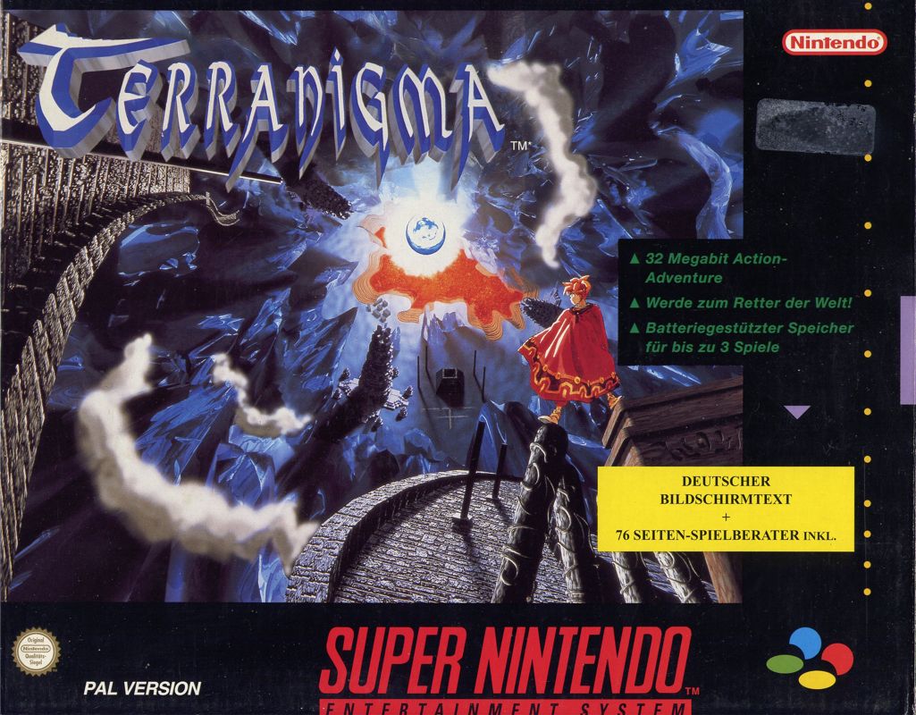
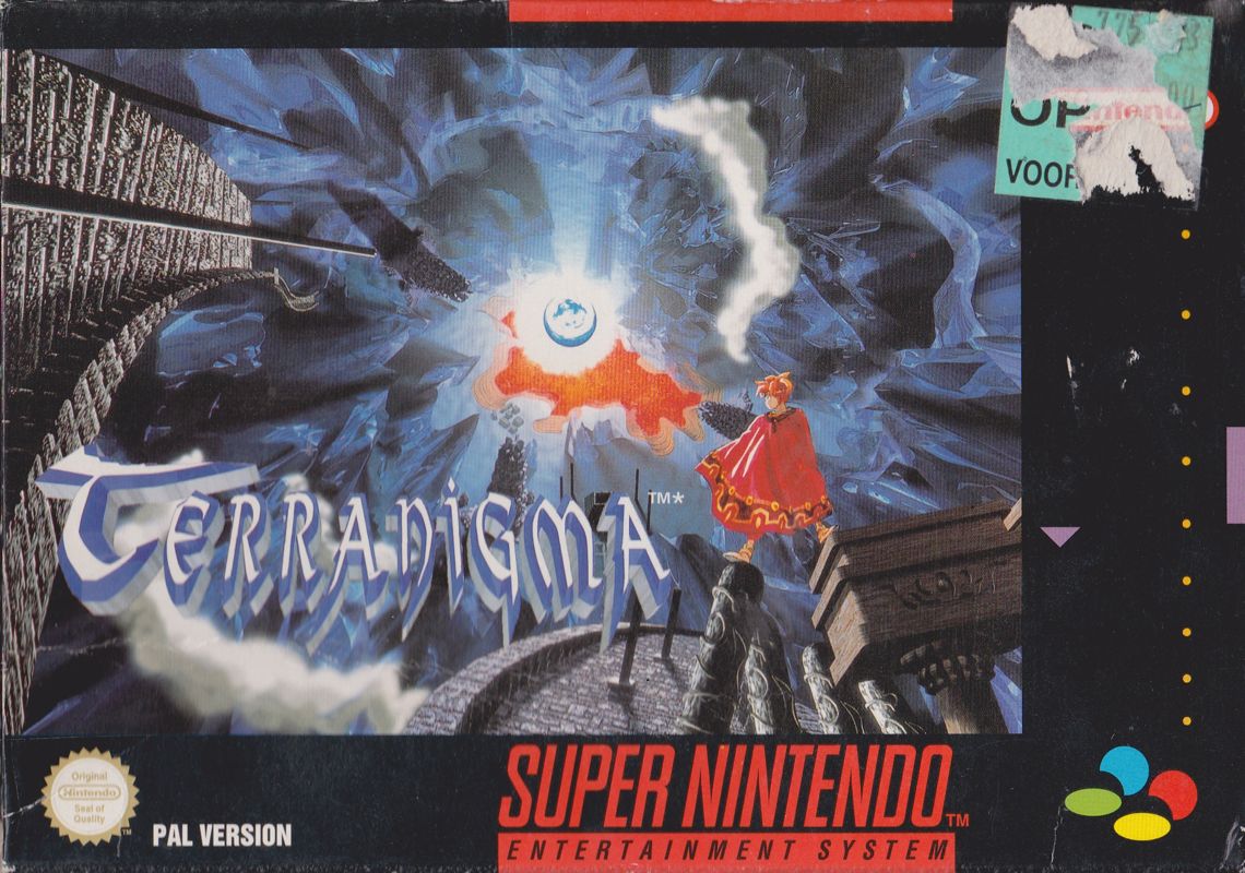
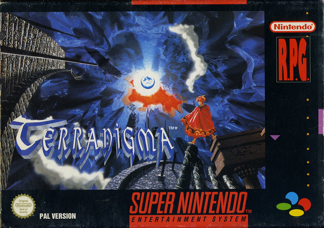
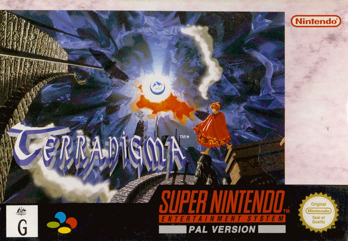
What's interesting is that later SNES releases ('95 onwards) in PAL regions started to kind of replicate the NA box art designs themselves. Take Terranigma for example:
120913-terranigma-snes-front-cover.jpg
6659983-terranigma-snes-front-cover.jpg

10055246-terranigma-snes-front-cover.png
4330285-terranigma-snes-front-cover.jpg

These are the German, British & Irish (Top row), Spanish and Australian & New Zealand (Bottom row) releases. As you can see; subtle differences between them all even though they were trying to do the more uniform look the NA ones have, except for Australia and New Zealand who kept the classic PAL style box arts going (I think they got the best one out of this bunch if I'm being honest).
 
Beware: There have been no replies in this thread for 90 days.
Keep that in mind when expecting a reply from the people on it,
You can also start a new thread instead. This is just a heads-up, bumping is allowed in this forum.

Users who are viewing this thread

Connect with us

Support this Site

RGT relies on you to stay afloat. Help covering the site costs and get some pretty Level 7 perks too.

Featured Video

Latest Threads

metal max 2 reloaded tips needed! (mainly vehicle help)

I've been playing this games translations for a while now and overall I've been enjoying it! fun...
Read more

How do you speed up the game you're playing without using fast forward function?

Certain games such as SRPGs or Strategy Games unfortunately run slow in that it takes 3-4...
Read more

Best set ups for a boss fight

I'm talking about anything that gets you excited for an upcoming boss fight, or maybe makes you...
Read more

Another Game Developer, Here to Lick my Father's Boots....Good Job

Hello, I figured maybe I should post here about some games I've made over the years. Someone...
Read more

Alien vs Predator on Jaguar was revolutionary

I already liked the game on its own right, but this video goes into lots of interesting details...
Read more

Online statistics

Members online
199
Guests online
3,888
Total visitors
4,087

Forum statistics

Threads
21,701
Messages
547,805
Members
1,008,557
Latest member
fuboo79

Today's birthdays

Advertisers

Back
Top