SNES How do we feel about the U.S. SNES design?

Had to put my money where my mouth is. It was $70, less than Mario Kart World, and I cleaned it all up.
IMG_6361.jpeg

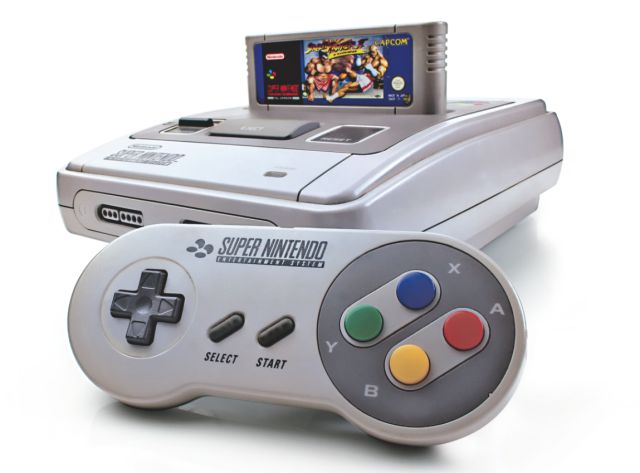
All clean, this thing is beautiful to me. It’s very hollow though, which I can see being an issue for many people. You can literally tell how hollow the system is via the eject button.

IMG_6363.jpeg

Here it is all cleaned up.

IMG_6362.jpeg

And here is the bottom. The only part that couldn’t be fixed with the clean was that one of the feet was crumbling. I cleaned and then fixed it like I would fix myself.

(It’s on the bottom. Nobody will know.)
Post automatically merged:

I must ask, is it okay to yoink the components that region lock it?
 
I like it. I like the design of the console. I like the carts. I like the little door that opens and closes to keep the dust out. Sure it discolors if you leave it in the sun, but there's ways to fix it.
 
Not a fan of the design of the US SNES, but that never mattered for me as long as it was functional.

If I had to guess why it looks that way, I think there are 2 main reasons: (1) to make it look less like a children's toy, so no bright colored buttons, no rounded edges like a toy computer. The design is a bit retrofuturistic, especially with the design pallet using astronaut matte grey (ex. Millennium Falcon). A lot of tech back then only came in that color or creme. (2) Cost cutting. The shell is a lot simpler and takes less assembling and requires less materials.
 
When I was a kid, I thought it looked pretty cool with the minimal colors and fancy buttons. Hey, kid me also grew up with the Sega Genesis in the house so I guess both were cool regardless. Looking back at it now, I can understand how it is seen as iconic. Some would say they grew up more with the NES and/or Atari consoles, but I still vividly remember both the SNES and Sega Genesis because of the constant battle of the games back then...

But it's off topic and one to save for another thread: I still liked the SNES design and while I do prefer the colorfulness that the other counterparts had, it's the US NTSC that feels more nostalgic to me. If I had the option though, I wish it did have the colorful buttons like the PAL one did. They're so pretty. /srs :love:
 
Honestly I like the little controller. I think purple is a nice color, smooth on the eyes and the shape round and a step up from the sharp square design on the hand. If my hard shell didn't cover up my Switch I would have had SNES skin and matching button covers on the joycon to go along with the homage.
 
I always wanted one of the Japanese/European Super consoles, but having one imported here would be rather pricey, to say the least, and it's really not worth it for me anymore. However, I genuinely like the way the non-U.S. Super Famicom looks.
Post automatically merged:

I'm sorry, but as an european... the snes is this

7LA2W34YG5J6RNTJOVPGIVMQE4.jpg


the american snes... it has always looked horrible to me...
I always thought the EU version of the Super Famicom looked like a sports car from the front, kind of
dqxsqunke7k31.jpg
 
Last edited:

Users who are viewing this thread

Connect with us

Support this Site

RGT relies on you to stay afloat. Help covering the site costs and get some pretty Level 7 perks too.

Featured Video

Latest Threads

OutRun for Game Boy Color

People who put their newest videos or livestreams on YouTube behind a paywall deserve to have their channels revoked.

I'm sick of YouTube content creators charging for everything. I get that it's a job and it's...
Read more

Beloved mediocrity: What mediocre and/or unpopular games do you really love?

It happens: a game comes out and it’s pretty mediocre, and after a while it falls out of the...
Read more

hajime no ippo

i want hajime no ippo victorian spirits psp game translated asap. i really like it but because...
Read more

Online statistics

Members online
94
Guests online
227
Total visitors
321

Forum statistics

Threads
12,441
Messages
303,878
Members
865,204
Latest member
Aves4732

Advertisers

Back
Top