- Joined
- Dec 11, 2024
- Messages
- 391
- Level up in
- 109 posts
- Reaction score
- 2,879
- Points
- 2,477
Oh Working Designs LOLView attachment 73861
Post automatically merged:
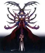
here's another one I quite like.
View attachment 74179View attachment 74180
Now witch one you like more is all a matter of taste but I have to applaud the effort of Working Designs for making such a sick model of the final boss.
View attachment 74183View attachment 74184