What’s the laziest/most boring game boxart you’ve ever seen?

Wtf all those logo only boxarts you guys have posted here are actually really good, stop baiting me 😭 Especially that Linda 3 art, I love it.

Also, this could practically be a thread of NTSC covers lmao. They are boring, sometimes lazy and just plain unappealing most of the times, I think this one takes the prize
1747849467267.png


Also this
1747849677173.png
 
Wtf all those logo only boxarts you guys have posted here are actually really good, stop baiting me 😭 Especially that Linda 3 art, I love it.

Also, this could practically be a thread of NTSC covers lmao. They are boring, sometimes lazy and just plain unappealing most of the times, I think this one takes the prize
View attachment 71613

Also this
View attachment 71620
Well not that they are bad, but they are really lazy and boring lol. There are lots of lazy visual artworks but they are really fun artworks therefore good.

Do you know why only the paintings that were not boring made it to our modern days by they really bothered not to burn the paintings to warm themselves during winter? Because these paintings are nice to watch. Back then people had no TV, so they painted stuff and even built buildings so you could just sit there and watch the fine details. You could even watch clothes back then for how great it's to even look at and try to comprehend all the deeper meanings about whatever you see on them.

Modern people cannot understand how clothes were used in a uniform logic that only allowed to be wearable by certain people in certain social layers. Now, people have lots to watch as their sense of "watching" is limited to movies and whatnot. It made sense of "art appreciation" changed too. Now everything is so dull, not that it's bad per se, it's just the preference people have anymore. Most people glued to their smartphones being so away from actually aware what kind of reality they living in. They are stuck in their own underdeveloped sense of self therefore they have no idea who they are. They are too distracted to get to know themselves and companies decide what you should like. It makes people become mindless customers just to make capitalism work, but it's necessary because when money doesn't flow economy collapses then everyone goes poor and only very few enjoy how rich they are for a while but then they become poor too and then humanity as a whole suffers.

Another aspect of the topic is how hard it's to come up with a video game artwork. You gotta let people know what the game is about. People care about characters in it so they wanna see it. Then what the game is about make what the artwork can be very limited.

However, they can use comic artwork as an idea to evolve their sense of artwork to produce. People buy comics because they think they look cool. IDK why video games doesn't play it on anymore. If most video games actually looked cool they would make them sell in certain %.

As a result, video game companies believe everything about the industry has a standard despite most people have no awareness about it or cares. That's why some random guy on sports games is an industry standard. In Japan, RPG cover art of people floating in air is an industry standard. Everything about video game industry is a misunderstanding of what people wants but it's actually not what people want but how it always was so they keep it going because they believe this is a well-established formula just to ensure sales as they believe.

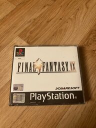
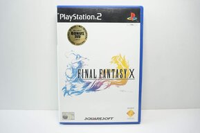
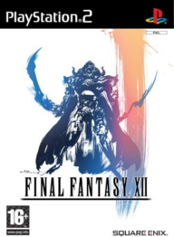
I was just gonna say that ALL PAL versions of FF games are so damn lazy and boring. It´s like they don´t gave a frack but then again Square did not give a crap my country did not get FF series until 7 we missed 1-6.

View attachment 71643View attachment 71644

I seriously thought it's some product of a junk food then I realized it's just final fantasy lol. One of my particular professor would seriously think it's one of the best example of a worst visual representation of a product. It's not clear what's that, let alone a video game. It's not clear what's that about, what it trying to sell. It make you question "what is final fantasy" but because of the word "fantasy" it kinda looks like a VHS porn tape until you realize it's not a VHS tape but you can be somehow sure it's probably about porn lolol. Only "PlayStation" as a word indicate "playing" so then you get "oh it must be what that game stuff kids play on tv" lol.
 
Last edited:
I was just gonna say that ALL PAL versions of FF games are so damn lazy and boring. It´s like they don´t gave a frack but then again Square did not give a crap my country did not get FF series until 7 we missed 1-6.

View attachment 71643View attachment 71644
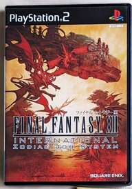
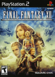
They might be lazy but they are pretty and pleasant to watch. Minimalist boxarts really fit the games much more than whatever they were trying in the US. That FFX boxart especifically is stunning imo
 
They might be lazy but they are pretty and pleasant to watch. Minimalist boxarts really fit the games much more than whatever they were trying in the US. That FFX boxart especifically is stunning imo
for me the white minimal feels way to clean and if you know the world of FF7 neat and clean does not fit the game what so ever.

Screenshot 2025-05-21 at 20-25-23 Final Fantasy XII 12 Game PS2 Amazon.se TV-spel.pngs-l1600.jpgScreenshot 2025-05-21 at 20-25-30 Final Fantasy XII US NTSC OVP RPG PS2 _ PlayStation 2 Sony C...png

I wanna say NTC and international edition is 100% more gorgeous than PAL.
 
for me the white minimal feels way to clean and if you know the world of FF7 neat and clean does not fit the game what so ever.

View attachment 71660View attachment 71661View attachment 71659

I wanna say NTC and international edition is 100% more gorgeous than PAL.
The right one I don't like at all, although the middle one is okay but I still prefer the classic white. In the end it's subjective. I like the minimal approach because it feels more mysterious and mystical. I don't know how to express it but those simple designs manage to convey to me such a strong feeling

It make you question "what is final fantasy" but because of the word "fantasy" it kinda looks like a VHS porn tape until you realize it's not a VHS tape but you can be somehow sure it's probably about porn lolol
Never stop gooning ig
 
View attachment 71652
Japanese cover of Port of Resident Evil 1 for Nintendo DS

The capcom could have put a zombie or hunter, but they chose to put a random crow to illustrates the cover.
But there is clearly a zombie in the crow. Damn this one actually looks cool lol.

Also for Japanese culture crow means a bad luck in a way where there is a crow there is death. It sets the idea of "it's a horror game" but why crow matters or rather abstract idea for zombie game is a basic fear from crow is it eating your head akin to a zombie. Crow is an abstract expression of a zombie (kinda).

I do understand your point though. The idea of crow could remain, but also zombies could be more obvious. Good idea poor execution.
 
When it comes to worst and laziest box arts its pretty much most of the modern games
Just take official render of main character copy past it into terrible gradient background, yep my job here is done, that will be 5000$ plus tax thank you
View attachment 71563View attachment 71564
Yep, main character on solid background gotta be one of the most boring design choices.
1747853132086.png
1747853190578.png

1747853280818.png
1747854248715.png


CVS1 Dreamcast cover is pretty lame. Just slap Ryu and Terry portraits on there then call it a day.
1747854001552.png
 
CVS1 Dreamcast cover is pretty lame. Just slap Ryu and Terry portraits on there then call it a day.
View attachment 71674
and as a curious fact in this Cover Art is that it was reused in the port of Capcom vs. SNK Pro on PS1 Version and it's the same only that they put "PRO" on the cover and that's it.
 
Last edited:
Surprised Ico for PS2 hasn’t been mentioned (The US cover), especially considering how much nicer the Pal cover was View attachment 71680View attachment 71681
Are you kidding, it was the first post on this page
 
However don't judge a book by its cover, after all the point of books are not reading their cover. What matters is the inside!!! You may apply this logic to people, fruits, video games and movies too lol.
yeah, that is true, but the point of a cover is to grab your attention and to get you to pick up the item in question and possibly purchase it at some point. going by most of the covers presented so far, it seems like the marketing team didn't know what the game was about, didn't care in the slightest or tried to create something that would make someone do a double take so that they are more likely to check the game out and buy/rent it.
some of these do look like rip offs, like the mobile light force. it straight up looks like a charlie's angel spin off game. others are just the title on a blank background or an image that vaguely relates to the game in question.
 
(Serious):
And the sad truth about the matter is, this: the box art for the original NES Tetris.
It has more imagination, thought, and style behind it than 90% of most games released in the last 15 or so years.

And, as I am sure everyone here is well aware, it's a game about falling blocks.
That's the worst thing. A lot of the Tetris games actually have simple but interesting box art.
s-l1200.jpg

And it did just what it needed to.
it was simple.
It caught your eye and showed exactly what the game was about.
With a few liberties, of course
 
Mobile Light Force 1, by the way:
View attachment 71588
I originally added it but it crashed when I was bringing the second game image over so in the end I was like “fuck this, it’s not worth the effort anyways, they look the same”
Post automatically merged:

You know, I never even noticed this, that is one hell of a downgrade.
Though iirc the first Ace Attorney was originally on GBA so I’m wondering if the box art was different there
Post automatically merged:

You know, I never even noticed this, that is one hell of a downgrade.
Though iirc the first Ace Attorney was originally on GBA so I’m wondering if the box art was different there
Bingo
1747859030734.jpeg

DS (USA) Ace Attorney 1 seems to be an anomaly worldwide, they’ve always looked the way they do
1747859280357.png
 
Last edited:
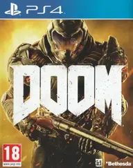
this could literally be the box art for any fps game with a guy in space armour.
I remember the reception to the box art at the time, it was the clown everyone pointed at until release, many edits of generically altering it to resemble other games proving it was way too bland.

It's not as bad, but Bioshock Infinite is another really weak one for similar reasons and I feel like it doesn't represent the game very well:

1000117106.jpg
 

Users who are viewing this thread

Connect with us

Featured Video

Digimon World: Next Order (VITA)

Latest Threads

[N64] Need help with my mupen64 emulator

I'm playing wonder project J2, but it's so laggy DX , it keeps slowing down so much. Does anyone...
Read more

GTA 6 idea

It would be awesome if GTA 6 had discord presence that shows if you're in the strip club
Would...
Read more

Castle Escape update

updated to 2.0.4 in the last month...
Read more

List of Wii games that can be only played with a GameCube or Classic Controller

Is there an official list of games that don't require the wii remote?


Furthermore: what's the...
Read more

Online statistics

Members online
137
Guests online
348
Total visitors
485

Forum statistics

Threads
8,205
Messages
206,469
Members
622,728
Latest member
Matheus017

Support us

Back
Top