What is the ugliest console you've ever seen?

100% disagree on the design. I loved how it looked and you have to remember what TV's looked like at the time: we still had these big black box dvd players, your speakers may have had a box to control volume settings, and you probably had a dvd case. All of these things were usually long bricks like that and the design of the 360 re-release blended in perfectly with all the other boxes under your tv.

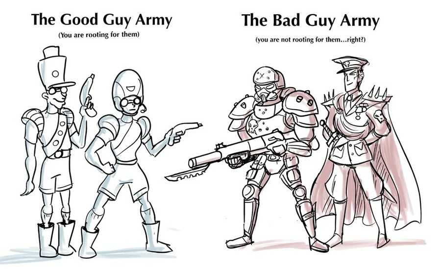
A design I don't like would be the Sega Genesis specifically when you put all the attachments on it!
View attachment 144168
This thing is huge! It takes up a lot of space and none of the attachments really complement each other since they all want to be self contained circular looking designs. Each one on its own looks great, but all together it just doesn't flow well visually.
I’ve always known and felt that the CD attachment looks good only with its corresponding Mega Drive model. The model 1 CD looks good with the model 1 Mega Drive and the model 2 CD looks good with the model 2 Mega Drive. But mixing and matching is… rough. The Model 1 Mega Drive with a Model 2 CD looks… okay? But it’s clearly not the original intent, requires an extension to look right, and is, as you said, LONG AS HELL.


But the 32X and Power Base Converter just don’t look good. The Power Base Converter feels like some sort of unholy matrimony between the angular and boxy design of the Master System model 1 and the curved circles of the Mega Drive model 1. And the 32X feels like it was designed with the model 2 Mega Drive in mind but it still looks bulbous no matter what. It’s like a growth on top of the console.
 
Bally-Arcade-Console (1).jpg
 
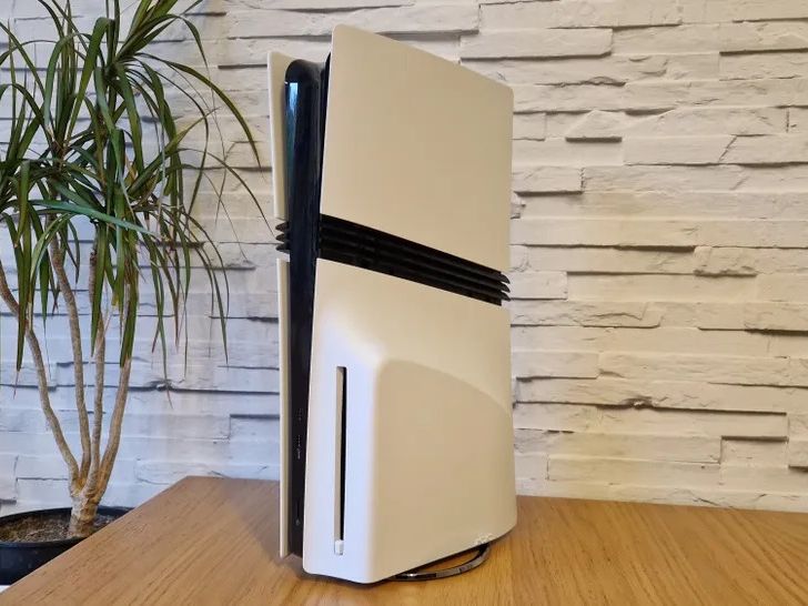
I’ve always felt the conflict of how much I love the base PS5 design, this giant piss off techno tower and space ship with vast flat plates, and the slim model. The slim has vents that break up and conflict with the original design, is smaller but still large (not fixing the issue of size, while also coming across as unsure of itself due to the size reduction), and has these ugly plastic stands that look like they’ll snap.

The slim feels like an attempt to fix the issues of the original model… but it’s still aesthetically similar to the original model. So it just comes across as an awkward and unsure of itself design. At least with the original model it was PROUD to be this giant beast of a thing. You may hate it, but at least it had confidence. While the slim is just unconfident.
 
I think it’s a common theme in this thread to pick on second generation systems. I don’t necessarily always condone that, since many had an unenviable task, but there is ONE that is perfect to pick on.

IMG_7857.webp

Feast thine eyes. It’s the Coleco Telestar.

How do you solve the problems that come with the many control schemes that arcade games have? Why, you simply build them all into the console of course!
There is no way to store this thing. When played, it is expected to be within arms reach of the player at all times. The steering wheel is uncomfortable cheap plastic that has become even more brittle with age. The gun is much of the same, if not worse. I have HELD ONE IN MY HANDS, so I can confirm the feel of the machine isn’t exactly pleasant. And, of course, it goes as far with the triangle theming as one can go.

I almost like this thing. It’s so out there, so bold, and so sure of itself that it nearly wins me over. And, as a lover of wood grain on any kind of electrical device, I think the colors and patterns of the machine are appealing. But it’s simply too much, even for my apologist self. This system is the exact reason why peripherals are sold separately: since otherwise you’d have to put up with a full steering wheel on the body of your game console. If this is supposed to replicate the arcade experience, it isn’t working, because no single arcade would ever have you hold a light and cheap triangle with two other control schemes on it in order to play.
 
That poor kid is being tortured with a one eye console that plays red and black color games.
View attachment 144195
I was going to post this! Apparently there is an even more obscure version of it called the DataZone:

1000002641.jpg

It begs for apocalypse.
 
Looks like it'd be hell to handle, too.
I can actually vouch that it’s ALMOST comfortable. But the issue with the cheese wedge is the lack of support for the bottom of your hands. It’s shocking that Nintendo would later replicate this exact problem with the design of the joycons, which have a similar overall feel in the hands to a 2DS.

It’s not the worst of the 3DS line, but it’s not good either. It’s strictly a cheap way to play the system’s library, best suited for those who don’t want to invest too much in it. As a result, they sold very well.
Post automatically merged:

I was going to post this! Apparently there is an even more obscure version of it called the DataZone:

View attachment 144197
It begs for apocalypse.
What The Hell Wtf GIF
 
I would likely to show you the Onlive-console but i forgot ... it doesnt really exist anymore .... for the better.
1000095128.gif
 
Look, it’s become more of a popular opinion with time, but genuinely this thing.

View attachment 144157
The benefit is that it’s still a 360. And it has some nice color variants, I will admit. But it’s just a brick. Like, it has all the components of the other 360’s, but they’re all warped and shrunk into the single most ugly version of themselves.

Look, even to this day, I love how you turn the 360 system on. It’s this big ominous light that senses your hand. It still TO THIS DAY feels futuristic to me. And they literally turned it into the smallest, most insignificant little button version of itself. Now, it’s all the insignificance of a button BUT WITH THE LACK OF TACTILE FEEDBACK OF THE ORIGINAL MECHANISM! So it’s just the worst of both worlds now.
Lol I do like this design.
Post automatically merged:

Love this console, but PS3 super slim is ugly as hell.
 
Super Nintendos when they turn yellow
View attachment 144294
Yup. Made a whole thread about it, that’s how much I hate how they look. I actually am very fond of the SNES design, but when it yellows it looks like its caught syphillis.
 
Personally I think the ugliest are the PS5 Pro, PS5, and PS Portal, in that order lol. There's certainly a lot of ugly designs from the super retro era (I never personally cared for any of the Atari console designs), but I honestly can't name a single thing I like about the current PlayStation designs.

The curves look dumb and make it unstable when laying flat, the contrast between the black console and white plates looks dumb, the fins on the Pro look dumb, it's physically massive, and that glossy black plastic is so hideous!! There is not a single place you can put a PS5 in a house without it sticking out like a sore thumb. It looks like a cannibalistic alien trying to be sexy.

I genuinely think the fake rumored PS5 looks better than the one that came out.
abfab25bab2499c6-600x338.jpg


But I have to give Sony props... They somehow made a console more expensive than the PS3, with a design that makes it look as cheap as plug-and-play knockoffs.
 

Users who are viewing this thread

Connect with us

Support this Site

RGT relies on you to stay afloat. Help covering the site costs and get some pretty Level 7 perks too.

Featured Video

Latest Threads

Rule of Cool: Good Guys vs Bad Guys

Nothing suspicious in the park, only a curiosity

*Engages in a smal amount of Tomfoolery leaving a soccer ball full of concrete near a goal*
Read more

Do you annotate your books?

For those who purchase physical copies, do you annotate them?

I highlight, underline, and write...
Read more

Ayn Odin 2 vs Odin 2 Portal vs Odin 3

I found myself going down the Ayn rabbit hole. Funnily enough it started with me looking at the...
Read more

Objectively good and bad games

Do you feel like these exist? I was thinking how everyone has different tastes and something...
Read more

Online statistics

Members online
98
Guests online
751
Total visitors
849

Forum statistics

Threads
16,168
Messages
390,965
Members
899,402
Latest member
BreadAndButter71

Today's birthdays

Advertisers

Back
Top