Repo new design

Moloch

Demi-God
Level 2
42%
Joined
Dec 1, 2024
Messages
163
Level up in
87 posts
Reaction score
260
Points
727
Location
𐤑𐤓
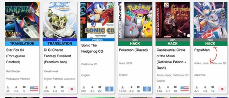
I'll be honest - I don't like the new design. In my opinion, those new labels do not fit nor look nice.

I would suggest finding another approach for labels that does not introduce redundancies (as highlighted in the image) and visual clutter.
This was not written to hurt anyone's feelings. This is not the intention. There was effort put in it and that it was well intended, I am sure of it - as my here comments also are. I just think, from a graphic design point of view, it doesn't work. :-)
I guess the intention was to have all the different types of entries more easily recognisable? You may want want to spend a bit more time looking for a better option, instead of those labels. Maybe other labels, maybe having the blocks with background colours?

I guess people can comment here and share other ideas. ;-)
 

Attachments

  • screen.jpg
    screen.jpg
    247.6 KB · Views: 30
Im on the opposite .
I like the labels and i can clearly see what this game actually is .

Just a translated game , a hack or an original game .

It takes time to get used too and maybe later on it will be smoothed out into a much better look but i like the change .
 
Im on the opposite .
I like the labels and i can clearly see what this game actually is .

Just a translated game , a hack or an original game .

It takes time to get used too and maybe later on it will be smoothed out into a much better look but i like the change .
Exactly, being able to see at a glance is very useful. Not only for users, but curators too, when updating entries.
 
Exactly, being able to see at a glance is very useful. Not only for users, but curators too, when updating entries.
Had the problem yesterday when i searched for the original Super metroid and thought about that change oit of a sudden . Took me a long time to find it because alot of them were hacks and i just wanna play the original version and design of it .
 
I'm not a fan yet either, but I'll give it time. The labels feel oversized, and the stacked colors are a bit distracting. A small colored icon in the corner might be subtler yet still effective. That said, if it helps others, that's what matters most.
 
Last edited:
I'm not the biggest fan but I think the issue is the font and size/caps. Changing that could make it more pleasing but still convey the same information.
 
I disagree. The labels work. They're functional, clear, and actually solve a real problem: quick identification. Translation, hack, original, those distinctions matter, and now they’re visible without digging. That’s a win.

Redundancy? Maybe. But it’s intentional. It reinforces the type at a glance, especially when scrolling fast or curating. Visual clutter is subjective. Some people want minimalism, others want clarity. This leans toward clarity, and I’m fine with that.

If anything, the design could lean harder into utility. Background colors, iconography, maybe even filter toggles. But scrapping the labels entirely? That’s a step backward.
 
I'm sure it can be further tuned to be nicer, but I like the idea a lot.

I'm sure Spike and other people in charge are open to suggestions. For instance, maybe the labels would look better near the bottom of the "game info box", right above the flag, download count and rating.

Also, assuming that change isn't desired, an empty label could be added to the games that have no label, so things look more consistent, better arranged (at the moment, the titles of games with no label aren't aligned with the others, and vice versa).
 
The design is in flux. In any case, it's important to note that the labels are opt-in. I personally like them.
I don't have any issues with labels, only with these labels.
As they are they don't provide any clarity, contrary to what someone else said. They are too close to the console/system name, and all those colours shouldn't be together like that. Fonts, sizes and orders don't make sense - no graphic design harmony at all.
You might like it as it is - I believe you (all), but considering these graphic design notes, I know what I am talking about.
 
Imho, the font is too large where the type is indicated (hack, translation, etc.), but in general, the idea of indicating and highlighting this information is useful.
 
it's important to note that the labels are opt-in
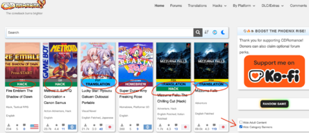
As RageBurner mentioned, there's a feature that allows users to hide them if they prefer the previous layout.

You can tick the "Hide Category Banners" checkbox, located beneath the "Hide Adult Content" checkbox.
hide-category-banners.png


Also, i thank all users who shared their opinions. 😊
 
On one level it looks kinda weird. On another level though I like it.

Overall... better for the most part. A bit jarring but utilitarian none the less.
 
If letting things roughly as they are, then I would change at least this:

Move the name of the system/console above the art cover, instead of the current location too close to the other labels - basically separate the name of the console and the type of entry.
Also, if you are adding multiple colours to the types of entries then, choose one colour only for all the systems: grey with white letters.You will have the name of the system on the top, followed by the cover art and below these new labels.
Furthermore, if not changing the position of that label at least having one unified colour for the system name would be already better

I will leave you with these two suggestions, you can use one, the other, or both. Or, you can leave it as it is, but as you can see on the image there is no consistency on the colours of those labels and the font sizes on the new ones, in my opinion, shouldn't be bigger than the names of the consoles/systems.

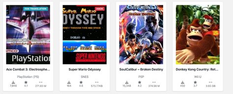
I am also sharing another image from another site, - see it attached, where I think the page/entry design is working well. ;-)

All the best
 

Attachments

  • screen_p.jpg
    screen_p.jpg
    202.9 KB · Views: 12
  • screen_k.jpg
    screen_k.jpg
    195.2 KB · Views: 13
Last edited:
As RageBurner mentioned, there's a feature that allows users to hide them if they prefer the previous layout.

You can tick the "Hide Category Banners" checkbox, located beneath the "Hide Adult Content" checkbox.
View attachment 117411

Also, i thank all users who shared their opinions. 😊
What the heck has happened? That option doesn't seem to be in effect anymore. The awful labels are back and not opt-in anymore. ;-) @RageBurner save our eyes!
 

Attachments

  • po.png
    po.png
    1 MB · Views: 8
What the heck has happened? That option doesn't seem to be in effect anymore. The awful labels are back and not opt-in anymore. ;-) @RageBurner save our eyes!
there's no labels at all on Vimm's or Myrient, if you'd like to try
 
there's no labels at all on Vimm's or Myrient, if you'd like to try
I am not sure if those are a good comparison. On Myrient the files are organised by folders, and appearing in alphabetical order, just like on the Archive. Navigation through folders can become labyrinthic, confusing, and finding the right folder can be time consuming. However, files on Myrient are actually well organised and any one can easily understand what file is/has, because there is a consistent naming structure. A while ago, I also proposed here the adoption of a naming structure due to the many files available per post, sometimes having semi-random names.
And while we are on a Forum and this section is for suggestions, I get your point. Indeed, one can simply accept what has been served and move on, or go elsewhere. There are many sites doing many things. And if you want a good example of the opposite, a site using labels (and well), I have share one before (in a screenshot): Romfun, labels simple and effective.

My last comment, though, was not to reopen the debate about web-design.
The toggle/radio button that hides the labels has some bug and is not working anymore. Maybe someone can fix it?
 
someone sure will repair the button soon or later, today's sunday (at least for me)
 
Last edited:
The labels I'm all for them,( someday I may find the elusive original Streets of rage 2 ) but I do have my differences with the coloring schemes.
 

Users who are viewing this thread

Connect with us

Support this Site

RGT relies on you to stay afloat. Help covering the site costs and get some pretty Level 7 perks too.

Featured Video

Latest Threads

Dragon Warrior IV - Manual Tactics

Sometimes, the simplest change makes the biggest difference
Dragon Quest came with a big flaw...
Read more

Shining Force II - Shining Force II Maeson [Genesis/MD]

Which of these 2 Animes are better

To me I choose Panty and Stocking,nobody likes to watch a boring slice of life anime
Read more

Dream Table Poker (DEMO)

A Texas Hold'em game in development for the Dreamcast, from Glowharestudio
the relese is planned...
Read more

What Got You Hooked On Comics?

So what tickled the serotonin in the back of your brain when it comes to "four-color funny...
Read more

Online statistics

Members online
89
Guests online
555
Total visitors
644

Forum statistics

Threads
14,900
Messages
357,601
Members
895,643
Latest member
sonyanyanya

Today's birthdays

Advertisers

Back
Top