- Joined
- Oct 2, 2024
- Messages
- 139
- Level up in
- 111 posts
- Reaction score
- 269
- Points
- 1,727
- Location
- Miami, FL
"American Kirby is hardcore."
Or Kirby is angry that the logo takes almost half the box. I would be.
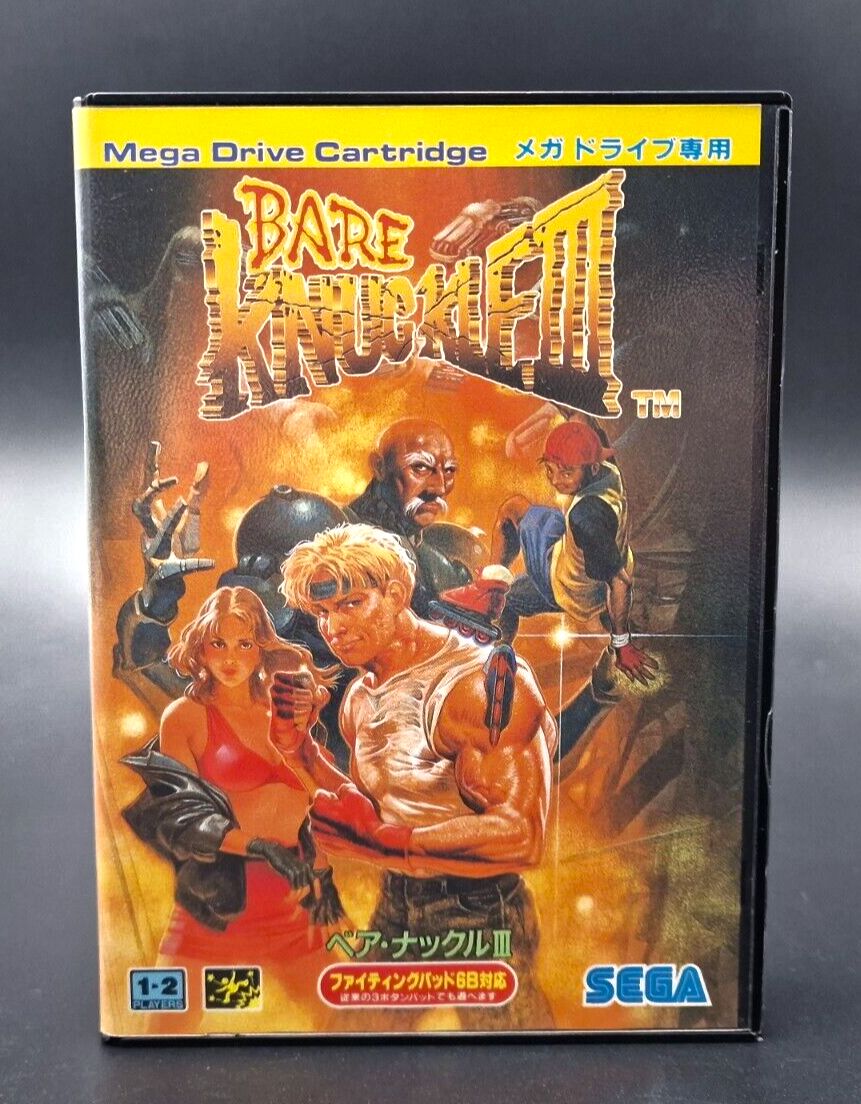
Oh Working Designs LOLView attachment 73861
Post automatically merged:
here's another one I quite like.
View attachment 74179View attachment 74180
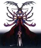
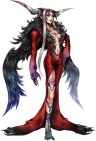
Now witch one you like more is all a matter of taste but I have to applaud the effort of Working Designs for making such a sick model of the final boss.
View attachment 74183View attachment 74184
Working Designs wasn't all bad! They may have made a lot of questionable decisions but at least they where releasing games in the west all the other publishers where passing on. I kind of enjoy the "unique" charm their translations have, dated references and all.Oh Working Designs LOL
I agree, but I never liked the overuse of (what I assume is) airbrushing on the U.S/western boxes of the era.Some might disagree, but what came into my mind was Mega Man 6's US boxart.
I'm sure we can all agree that US 6's boxart is at least better than all the previous US boxarts, right?
I'm split on the Final Fantasy boxes. On one hand I like how each games unique logo/symbol pops on the white, but on the other I do actually like seeing more of the games artwork. It's a case of minimalism done right.Final Fantasy VII's USA box art is way better and more iconic then the Japanese/European box arts: View attachment 74429View attachment 74431View attachment 74432
The same applies to Final Fantasy VIII and IX: View attachment 74447View attachment 74448View attachment 74449View attachment 74450View attachment 74451View attachment 74452
idk know why they didn't use the tatuso art like in the spanish retranslation:Final Fantasy VII's USA box art is way better and more iconic then the Japanese/European box arts: View attachment 74429View attachment 74431View attachment 74432
The same applies to Final Fantasy VIII and IX: View attachment 74447View attachment 74448View attachment 74449View attachment 74450View attachment 74451View attachment 74452
But I like SteinerYeah. Again I think it is a case of brand reinforcement, here, as with N's boxes. For FF9, anyway, I don't like that weirdo Steiner looking at me, anyway.

I understand why you like the FF VIII box art (since it has the symbols that I've always thought were pretty cool), but I always thought that the FF VII and IX box arts were incredibly bland in general.I'm split on the Final Fantasy boxes. On one hand I like how each games unique logo/symbol pops on the white, but on the other I do actually like seeing more of the games artwork. It's a case of minimalism done right.
This isn't official box art, it's fanmade.idk know why they didn't use the tatuso art like in the spanish retranslation:
View attachment 74472
I totally agree/ trueWorking Designs wasn't all bad! They may have made a lot of questionable decisions but at least they where releasing games in the west all the other publishers where passing on. I kind of enjoy the "unique" charm their translations have, dated references and all.
I've always found him amusing, and he becomes less annoying and better towards the end of the game.Steiner clanging sounds when he runs make me laugh, but that's the extent of my liking for him.
this is my favorite scene (and song) in ff9:Steiner clanging sounds when he runs make me laugh, but that's the extent of my liking for him.
when i played this game first time through, i just put the controller down and listened for over 15 min. straight. /truethis is my favorite scene (and song) in ff9:
I think an example of a minimalistic cover that I find better is the Japanese box art for Chrono Trigger:I understand why you like the FF VIII box art (since it has the symbols that I've always thought were pretty cool), but I always thought that the FF VII and IX box arts were incredibly bland in general.


That Chrono Trigger cover looks really clean. All Toriyama art is good (rip). Think it was either the GBC port of DQ3 or DQ7 where the US covers started to use it. I like the US cover of 3 here more.I think an example of a minimalistic cover that I find better is the Japanese box art for Chrono Trigger:View attachment 74673Since this more minimalistic box art shows most of the main characters from the game.
The japanese one looks like a children storybook.That Chrono Trigger cover looks really clean. All Toriyama art is good (rip). Think it was either the GBC port of DQ3 or DQ7 where the US covers started to use it. I like the US cover of 3 here more. View attachment 74691View attachment 74695
I think the idea was to shrink the characters down for the handle held version.The japanese one looks like a children storybook.
thank you for the clarification :)But I like Steiner
I understand why you like the FF VIII box art (since it has the symbols that I've always thought were pretty cool), but I always thought that the FF VII and IX box arts were incredibly bland in general.
Post automatically merged:
This isn't official box art, it's fanmade.