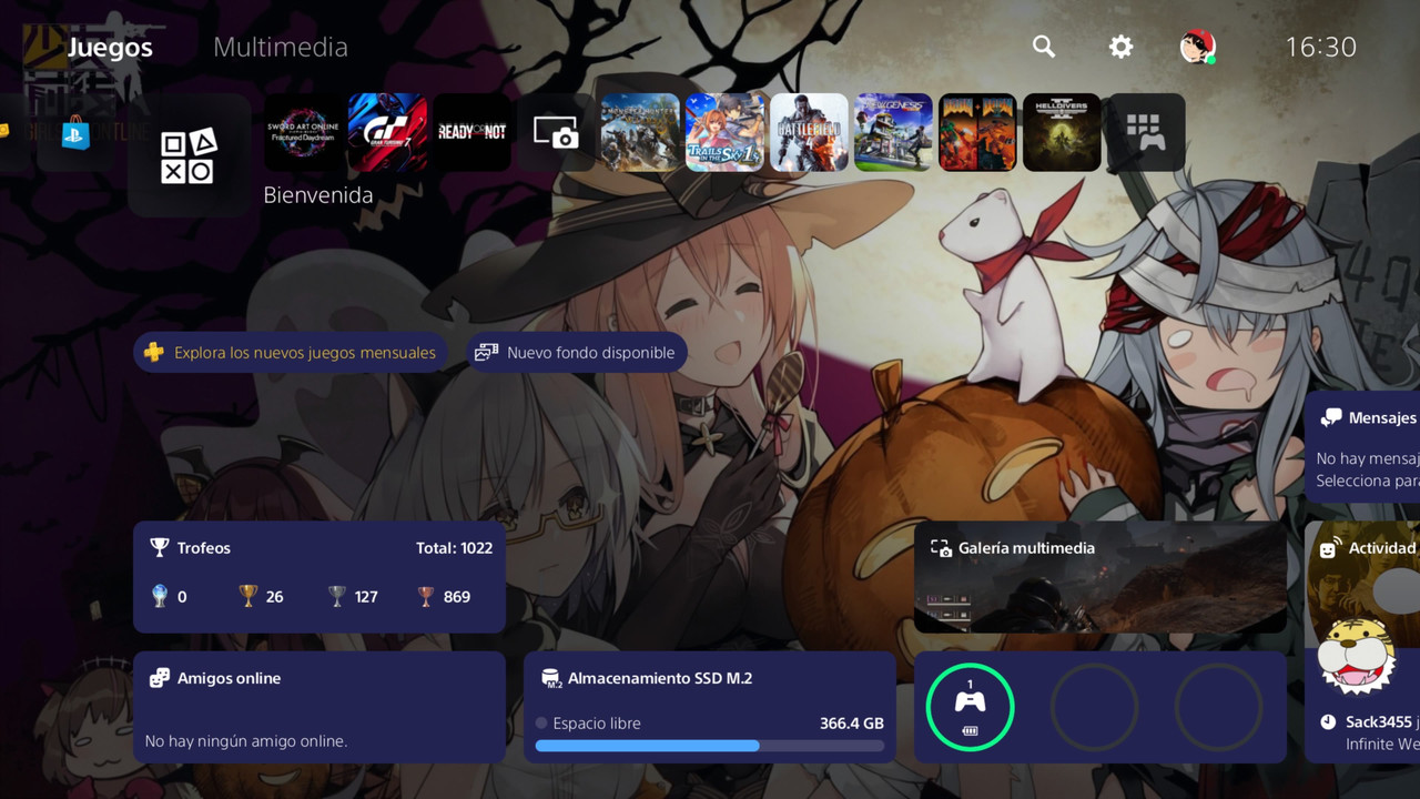
I don't like the console UI of the recent generations

Ikagura Ikagura

Final Form
Level 7
100%
Joined
Dec 3, 2024
Messages
5,005
Reaction score
7,079
Points
10,977
I don't understand why Microsoft has let down the Blade Menu, Sony the XMB and Nintendo the TV screens for their main UI on consoles.

It should've been obvious to keep what's working.

Nowadays it's either too minimalistic (Switch 1&2) or too cluttered with ads and other things (Xbox/PS) with no good in betweens.
 
Steam (it counts, right?) felt minimal for so many years, but at least Big Picture in the last decade evolved it with grace. I can't speak much for Xbox since I have only a 360, but PlayStation felt...fine?

But we can all agree, as you said yourself, that the winner for most disappointing UI is the Switch. And they refused to improve it with the new one. Seriously Nintendo? Even the 3DS and Wii U were better.
 
I loved themes on 3ds, even if as simple as choosing a colour when they introduced them; on Switch you can only change your profile icon :( I also liked both psp and psvita, on which you could fully customize colours and wallpaper. I can't speak for more modern ps console (3, 4, 5) because I don't have them.
 
Steam (it counts, right?) felt minimal for so many years, but at least Big Picture in the last decade evolved it with grace. I can't speak much for Xbox since I have only a 360, but PlayStation felt...fine?

But we can all agree, as you said yourself, that the winner for most disappointing UI is the Switch. And they refused to improve it with the new one. Seriously Nintendo? Even the 3DS and Wii U were better.
I think that the only thing salvaging the Switch's is that while it's too minimalistic it has less cluttering. I would still say that two rows as the default part of the menu would've been better.

Thankfully there are ways to order the menu by name or company and making files.

I loved themes on 3ds, even if as simple as choosing a colour when they introduced them; on Switch you can only change your profile icon :( I also liked both psp and psvita, on which you could fully customize colours and wallpaper. I can't speak for more modern ps console (3, 4, 5) because I don't have them.
Those were nice but I still think that it's a bit scamey to sell what are just skins, not something useful outside of cosmetics.

Same with medals on the 3DS.
 
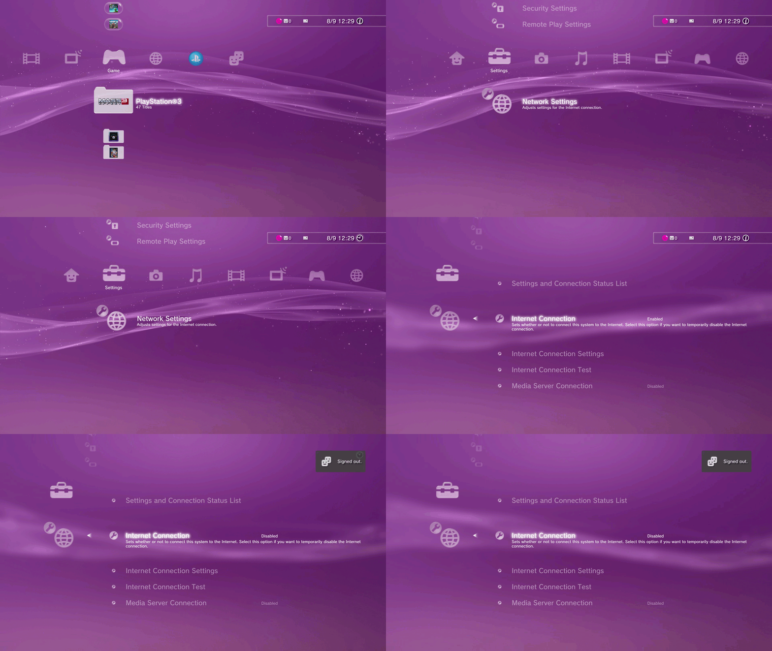
The bests console menus ever

DIsable-Network-PS3.gif


xaU6dn4.gif
 
I think that the only thing salvaging the Switch's is that while it's too minimalistic it has less cluttering. I would still say that two rows as the default part of the menu would've been better.

Thankfully there are ways to order the menu by name or company and making files.


Those were nice but I still think that it's a bit scamey to sell what are just skins, not something useful outside of cosmetics.

Same with medals on the 3DS.
About that, I've never spent money to buy themes: when I had only non-mod consoles I used the free themes (if I'm not mistaken my Zelda one was a gift with the Nintendo coins?). Also, I got "The Caligula Effect" one when I bought the game digital on Vita, back then, or else I had the blue background. I rarely bought digital games, dlcs only if there were quests/characters, I would not spend for themes :( About medals... if you mean the badges, I think they were free (and you had to pay if you wanted more try in the game with rabbit?)
 
Last edited:
XMB is the best menu Sony have ever made by far. I can't think on any better menu from anything else. It's so nice Retroarch has a XMB menu :)

But it's how it is. Progress & marketing means change, regardless if the new thing is worse or people is agree for a change. Only a few companies in the world believe on the sentence "if something is good, do not touch it".
 
I don't like minimalistic design, I'll take extremely messy maximalism any day.
 
The bests console menus ever

DIsable-Network-PS3.gif


xaU6dn4.gif
I know I'm in the minority here, but I never really liked the XMB. I thought it was too simple and it stacked icons in an ugly way. I thought the PS4 menu was an upgrade in most ways.

I got my Xbox after the Blades menu had been retired, so I don't really have an opinion on that, but I didn't like the one the replaced Blades with, though idk what it was called. I do like Blades though.

This is like sacrilege apparently, but I actually like the current iteration of the Xbox menu (not my screenshot, I have the OG Xbox graphic when not hovering over a game, which shows a wallpaper of said game). I like the top buttons, the information in the top left and right, and I like the icons. The "ad" section is hit or miss but I'm glad they made it smaller than it used to be.
1759501661459.png


I HATE the PS5 interface. It's unbelievably embarrassing that every game has some weird commercial-like slogan on the home screen. Like, I already got the game, why are you still assaulting me with blurb? Great sound effects, though.

@Ikagura and Nintendo the TV screens for their main UI on consoles.
Probably just because it was part of the TV shtick/gimmick the Wii had, like how it emulated using a TV normally with the controller being shaped like a remote.
I agree the Switch GUI sucks. It's so boring, and apprently is that way because the console was so weak, iirc. I thought the 3DS interface was their best one.
 
Last edited:
I don't like minimalistic design, I'll take extremely messy maximalism any day.
You can blame Apple for jumpstarting this thrend lol.

I miss Frutiger Aero from early Android...

Probably just because it was part of the TV shtick/gimmick the Wii had, like how it emulated using a TV normally with the controller being shaped like a remote.
I could kinda understand it but the Switch has a touch screen, nothing could prevent it from still having more than one row.

I agree the Switch GUI sucks. It's so boring, and apparently is that way because the console was so weak, iirc.
The console is weaker than its contemporaries but that's not an excuse when the DS, the DSi, the Wii and the Wii U are less powerful than the Switch itself yet had interesting UIs.

I thought the 3DS interface was their best one.
I kinda agree although I'd say that the original DS had that unique feeling.
Post automatically merged:

A mockup:

1759503252453.webp
 
The console is weaker than its contemporaries but that's not an excuse when the DS, the DSi, the Wii and the Wii U are less powerful than the Switch itself yet had interesting UIs.
Yeah definitely, but I remember reading somewhere when it was new that it had to be really barebones and as lightweight as humanly possible because it would slow the bios down way too much otherwise, which is why they never implemented themes even though the section is there on the settings. Probably had to do with the handheld mode and the console itself being this weird middle ground so corners had to be cut someplace.

It can easily be noticed when checking your profile on a console that's been used and is full of stuff. That little whistle noise takes a waaay longer pause than it did when the console was new and not cluttered inside.

I miss Frutiger Aero from early Android...
Haha, I feel like I'm the only person on Earth who never liked that Frutiger Aero shit. It doesn't feel intuitive at all imo. I was always a defender of flat design in general, but I'm an even bigger fan of neumorphism. I think they nailed much of it in Windows 11 in terms of readability, by still keeping simple shapes while going back to giving icons a bit more depth and color again.

I haven't had a chance to try out anything using iOS 26, so I can't speak for the next iteration of interface trends yet.
 
You can blame Apple for jumpstarting this thrend lol.

I miss Frutiger Aero from early Android...


I could kinda understand it but the Switch has a touch screen, nothing could prevent it from still having more than one row.


The console is weaker than its contemporaries but that's not an excuse when the DS, the DSi, the Wii and the Wii U are less powerful than the Switch itself yet had interesting UIs.


I kinda agree although I'd say that the original DS had that unique feeling.
Post automatically merged:

A mockup:

View attachment 116237

...literally fans do what Nintendwon't. This is really depressing lol
 
Any mockup UI is better than what 🅱️intendo has done, or more like what it HAS NOT even tried to do in 8 years already, every system out there feels the same, the only things that make them more unique and personal are what games it has loaded.

They are very capable of fixing this and even get some profit out of it, it's just classic Nintendon't stubbornness.
 
Ayy good to see you here again ::yay
just passing through to download some roms.

But on a more serious note:
The design philosophy of the XMB still lives on, horizontal navigation for the prominent/important content, like games. While settings and browsing detailed options is vertical.

The blades while cool mid 2000s edgy, was cumbersome and didn't scale very well with more content.
 
It is the modern trend of making everything as bland as corpo as humanly possible, because "efficiency". Just look at how Mcdonalds looks now and how it used to be, or other webpages.

Xbox dashboards have been on a decline since MS wanted to copy the Miis with they crappy avatars, now is just the ultimate form of blandness and boring. The only possible thing is that we can choose a wallpaper.

PlayStation 5 i would say it is one of the best: we recently got a home screen (somewhat customizable) with background and themes (so far: PS1-2-3-4-5, hopefully they add more down the line). So I think it is my favorite

IMG-5419.jpg


Steam (it counts, right?) felt minimal for so many years, but at least Big Picture in the last decade evolved it with grace.

I must say that Im quite impress with the Steam bigpicture / Steamdeck UI. It is not THAT great, but pretty comfy
 
I don't understand why Microsoft has let down the Blade Menu, Sony the XMB and Nintendo the TV screens for their main UI on consoles.

It should've been obvious to keep what's working.

Nowadays it's either too minimalistic (Switch 1&2) or too cluttered with ads and other things (Xbox/PS) with no good in betweens.
I also hate how none of them seem to be able to handle more than 100+ games. You'd think with all the hardware power and their desire to make games all-digital they'd be able to do it, but no. PS4 lags to fuck if you have more than 150-200 games installed and it even starts messing with apps like the Browser. I refuse to constantly install and uninstall games.
 

Users who are viewing this thread

Connect with us

Support this Site

RGT relies on you to stay afloat. Help covering the site costs and get some pretty Level 7 perks too.

Featured Video

Latest Threads

Tmgs on the psp

Am I crazy for thinking tokimeki memorial girls sides 1 and 2 was in PSP??? I swear it was or am...
Read more

I falled into an interesting zx spectrum music rabbit hole

while diggin for new shit to discover I found singles and mixtapes released on side B of zx...
Read more

Inspector Gadget Mad Robots Invasion My Texture Pack HD for PCSX2

This pack was made for Inspector Gadget: Mad Robots Invasion, a PS2 exclusive released only in...
Read more

Sorted through some of my games today.

I got a new book shelf, and spent a good bit of time today sorting through my games and deciding...
Read more

Indiana Jones and the Staff of Kings HD Texture Pack for PSP (PPSSP) by MaximeCool + Download

My First PSP Texture Pack:

This pack was created for Indiana Jones and the Staff of Kings...
Read more

Online statistics

Members online
86
Guests online
1,241
Total visitors
1,327

Forum statistics

Threads
13,694
Messages
331,807
Members
882,192
Latest member
Zyxwv

Advertisers

Back
Top