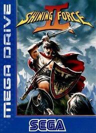
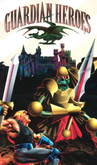
What’s the laziest/most boring game boxart you’ve ever seen?

Frickinfrik

Dragon Slayer
Level 2
Joined
Mar 11, 2025
Messages
106
Reaction score
212
Points
477
I think it’s probably these three:
IMG_0758.jpeg

Demolition Girl’s European boxart looks pretty sloppily made. It’s like a collection of stock images. Also it’s false advertising, You never go to Seattle in this game, also the girl does not look like that. Also how ironic that Seattle is on the cover despite the game never releasing in America.


IMG_0759.webp

Sonic 06’s boxart isn’t very great either. This feels like a temporary boxart. It doesn’t give a good highlight of what the game is mainly about. And yes, i know previous sonic games had just sonic on the cover but they at least gave a hint and had more effort put into it.


IMG_0760.jpeg

Most of Blast! Entertainment’s games have really shitty boxart. But I think Beverly Hills’ Cop Ps2’s boxart is the worst offender. It’s just a picture of Axel Foley’s car. They just edited the movie’s poster and removed Eddie Murphy from it. I don’t think a picture of a stationary car would get anyone excited.
 
1747844696587.png


Yeah, I know. I just did that. I can't say that I felt good about it either... But c'mon. Was the advertising budget for this title that low that they got this old banjo playing grandpa that didn't even smile and then photoshop some blurry ship and text and call it a day? And what about this guy and his banjo infers "HYPER-SPEED"?? I'm sure at some point I saw this at the rental and skipped right past it because of this cover, as probably did many people well before this became an internet sensation for its art.

I'm sure this thread will spawn many more postings of equally as bad box arts.
 
The original cover wasn't bad. It showed off the main character. It used a black/white motif to separate itself from the previous game and to give special emphasis on teh blood. Yet, it's not great, either. It also flipped expectations - thanks to Tim Burton's Batman film and Batman: The Animated Series (plus years of box art), we expect a portrayal of Batman / Gotham City to be dark. Yet, the only pop is the blood. It's a solid 7/10.
1747844809464.png


But I have no idea why Rocksteady changed the name of the game from Batman: Arkham City to 10 out of 10. That was a bold decision.
1747844882766.png
 
Last edited:
Honestly that Demolition Girl doesn't look too bad, at least something original
When it comes to worst and laziest box arts its pretty much most of the modern games
Just take official render of main character copy past it into terrible gradient background, yep my job here is done, that will be 5000$ plus tax thank you
1.png
2.jpg
 
Metal Gear Solid White background. Kojima really did know art when he saw it back then.

While on that sort of schtick, Crazy Taxi's box art for ps2 is basically gross to look at. That weird mustard yellow tinge that the logo just kinda sits on. Also what the sam-hill is that symbol the left by the "C" in the name is it supposed to be? It's got what I THINK is teeth so...maybe a monster? I don't know but this cover is just dumb. I mean what did you expect from sega after crawling from the ashes of their own dumpster fire

88c632e17d452a2f7e460ddf315bbdf2.jpg
 
I don't even have to show for I can tell:

Most sports games.

Most military related game.

Most racing game.

Almost every Nintendo game.

Almost every RPG.

Almost every puzzle/casual game.

Every video game released after 2010 (far fetched assumption I know, but lol).

To me it seems it would be actually too hard to find cover arts they really bothered. Then it can be another follow-up thread I would have fun lol.
 
The original cover wasn't _bad._ It showed off the main character. It used a black/whit motif to separate itself from the previous game and to give special emphasis on _teh blood._ Yet, it's not great, either. It also flipped expectations - thanks to Tim Burton's Batman film and Batman: The Animated Series (plus years of box art), we expect a portrayal of Batman / Gotham City to be _dark._ Yet, the only pop is the blood. It's a solid 7/10.
View attachment 71559

But I have no idea _why_ Rocksteady changed the name of the game from Batman: Arkham City to 10 out of 10. That was a bold decision.
View attachment 71561
(Serious):
The second one. The 10 out of 10 cover looks more like they scanned a game magazine cover to use for it, honestly
 
View attachment 71558

Yeah, I know. I just did that. I can't say that I felt good about it either... But c'mon. Was the advertising budget for this title that low that they got this old banjo playing grandpa that didn't even smile and then photoshop some blurry ship and text and call it a day? And what about this guy and his banjo infers "HYPER-SPEED"?? I'm sure at some point I saw this at the rental and skipped right past it because of this cover, as probably did many people well before this became an internet sensation for its art.

I'm sure this thread will spawn many more postings of equally as bad box arts.
Oh, I read an interview with the advertising agency about Phalanx years ago! Turns out they had played the game, they were aware of the Japanese covers, and had done covers to dozens (if not hundreds) of other games in the period, too! The reason why they did the cover this was was... they had absolutely no idea how to differentiate Phalanx from the dozens of other shooters already on the market that hadn't already been done, many by them.
  • Ship speeding at you? Gradius 3.
  • Emphasis on the pilot? UN Squadron.
  • Hyper stylized space battle? Earth Defense Force.
  • Flying away from the viewer? Thunder Spirits.
  • Flying out of a huge explosion? Darius Twin.
  • Stylized artwork of a boss? Super R-Type, among many others.
  • To say nothing of the metric duckton of other shooters on other consoles by Fall 1992
That's when someone, likely a fan of the first Superman movie, got the idea of making a cover based on the perspective...of a farmer seeing a spaceship fly by (much like Kal-El crib-ship falling onto the Kent farm in front of the Kent's startled eyes)! So, they used an actor (who they had used previously for other marketing photos, including dressing him as Santa holding an umbrella for the cover of an Oregon/Washington-based Christmas CD/album) who they thought had suffered a stroke at some point in his life and used the "old man model" gig to supplement his Social Security (pretty smart idea, if you ask me - nice side-hustle on the old guy), put him in overalls and gave him a banjo, snapped some photos, then had the art department do the rest.

But did the game sell well?

Eh, not really. But no-one really knows if the middling sales were due to the eye-catching cover (that we're still talking about 32+ years alter), or if it was due to the absolute glut of shooters already on the market... and a little game called "Street Fighter II" releasing earlier that same year diverting attention and money from shooters to fisticuffs.

Oh, and those Japanese covers I mentioned? One was too "Japanese-y" (most retailers in that era refused to stock Japanese-looking anything on their shelves due to both retailer and consumer biases/racism of the time and is why everything in the US got a redraw back then, which I've written diatribes on before) that resembled a squatting duck begging for bread crumbs... and the other for looking like a giant dong:
1747846484860.png
1747846562198.png


And that, my friends, is The Story of the Phalanx Box Art.
 
Last edited:
Malkavian(Insane):
*Eyes twitch* Oh, darling, laziness is an art form, and this is the Picasso of procrastination.
*snickers*
Besides, why settle for the original when I can paint my own chaos?
Maybe I prefer the beautiful mess. Or maybe I just like watching the world burn a little slower, hmm?

*sighs*
But no, go ahead... Don't use the original. It’s so boring, like a date with a corpse.​
dont-mind-me-just-remembering-and-appreciating-this-v0-xktk7l49tkwb1.webp
 
I think it’s probably these three:
View attachment 71551
Demolition Girl’s European boxart looks pretty sloppily made. It’s like a collection of stock images. Also it’s false advertising, You never go to Seattle in this game, also the girl does not look like that. Also how ironic that Seattle is on the cover despite the game never releasing in America.
That Demolition Girl boxart had me burst out laughing at the audacity so I guess it’s not that bad lmao

I’m trying to think of bad examples but no matter what I can never think of anything that shits the bed harder than Mobile Light Force 1 & 2
1747847291371.jpeg
 
Malkavian(Insane):
*Eyes twitch* Oh, darling, laziness is an art form, and this is the Picasso of procrastination.
*snickers*
Besides, why settle for the original when I can paint my own chaos?
Maybe I prefer the beautiful mess. Or maybe I just like watching the world burn a little slower, hmm? *sighs* But no, go ahead... Don't use the original. It’s so boring, like a date with a corpse.
View attachment 71580
*Let's put some random guys and let's not even bother with poses. Just make them stand but look at different directions." -- the most basic cover artwork lol.

IDK much about movie covers but any time I see one they are basically like this. Body of people or their heads floating in the air in a very creepy way as they have no idea how basic and BS it looks like lol.
 
This is about as lazy as you can get.
View attachment 71575
(Serious):
I agree, that is lazy. But to be fair, all the Sega Master System box art is like that, or close to it. A few have some, what I can only assume, are 12-year-olds' art on them. So I can't really fault this game for being lazy. It was just how SEGA did the MS games
 
That Demolition Girl boxart had me burst out laughing at the audacity so I guess it’s not that bad lmao

I’m trying to think of bad examples but no matter what I can never think of anything that shits the bed harder than Mobile Light Force 1 & 2
View attachment 71586
Mobile Light Force 1, by the way:
1747847603797.png
 
However don't judge a book by its cover, after all the point of books are not reading their cover. What matters is the inside!!! You may apply this logic to people, fruits, video games and movies too lol.
 

Users who are viewing this thread

Connect with us

Featured Video

Digimon World: Next Order (VITA)

Latest Threads

Can we save the Turbo-Grafix 16?

It’s 1989. We as a forum are now the launch team behind the international version of the...
Read more

Le Gaming Question about Translations

Ah, my dear compatriots of the gaming realm, have you ever encountered a translation of a Game...
Read more

looking for criminally underrated Anime Fighters or mecha RPG's

I'm an avid emulation gamer, and Im always on the look out for a new game or two, especially now...
Read more

Game/Fictional Characters you Dislike

I'll include a couple non-game examples


1000057674.png

Grace - Wolfenstein new colossus

Just...
Read more

anbernic rg556 vs retroid pocket 4 pro

Which console can play these games without any problems?
Pokemon Sword
Pokemon Brilliant Diamond...
Read more

Online statistics

Members online
156
Guests online
218
Total visitors
374

Forum statistics

Threads
8,158
Messages
205,000
Members
616,803
Latest member
Duneto

Support us

Back
Top