You are using an out of date browser. It may not display this or other websites correctly.
You should upgrade or use an alternative browser.
You should upgrade or use an alternative browser.
What Was Some Of Your Favorite Video Game Cover Art?
- Thread starter Sir Win
- Start date
- Joined
- Mar 29, 2025
- Messages
- 623
- Level up in
- 376 posts
- Reaction score
- 2,213
- Points
- 2,577
- Location
- mountain town
i love it dearly


the art is by jun suemi
the art is by jun suemi
- Joined
- Dec 1, 2024
- Messages
- 2,358
- Level up in
- 141 posts
- Solutions
- 3
- Reaction score
- 5,084
- Points
- 3,477
- Location
- United States
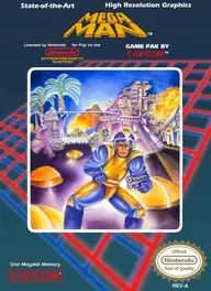
i posted this on another thread, but it fits here too.
an nes classic.

an nes classic.
- Joined
- Feb 27, 2025
- Messages
- 1
- Level up in
- 23 posts
- Reaction score
- 3
- Points
- 52
Instantly caught my eye when I was a kid,and learning that it was made by some of the people behind Earthworm Jim sealed the deal on me picking it up. Still an underrated favorite of mine
- Joined
- Oct 20, 2024
- Messages
- 832
- Level up in
- 167 posts
- Reaction score
- 1,724
- Points
- 2,477
- Location
- Nightopia
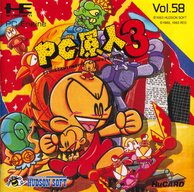
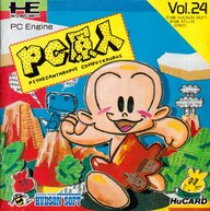
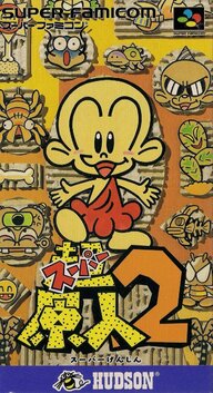
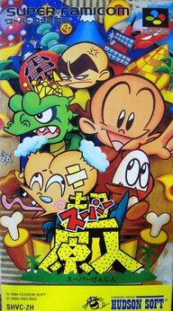
PC Genjin 2 (1991)

I like it because of the appearance of newspaper cut outs and other pictures, drawings patched together. The first and third game of the series also emphasized this style and 超/Chō Super releases.
I like it because of the appearance of newspaper cut outs and other pictures, drawings patched together. The first and third game of the series also emphasized this style and 超/Chō Super releases.
Attachments
Last edited:
- Joined
- Dec 1, 2024
- Messages
- 2,358
- Level up in
- 141 posts
- Solutions
- 3
- Reaction score
- 5,084
- Points
- 3,477
- Location
- United States
now, for a more serious answer to the question. a couple of my favorite box art covers come from my favorite games in the pikmin series. 1 and 2.


- Joined
- Dec 1, 2024
- Messages
- 436
- Level up in
- 63 posts
- Reaction score
- 1,292
- Points
- 1,977
- Location
- Europe
I absolutely love the old, super subdued PAL and JP PSX Final Fantasy covers and how they gave the series a unified appearance on your shelf.

Also, absolutely a cliché at this point, but Ico's (non-US) cover is definitely what jumps into my head when I think of good, evocative cover art.

Also, absolutely a cliché at this point, but Ico's (non-US) cover is definitely what jumps into my head when I think of good, evocative cover art.
- Joined
- Dec 8, 2024
- Messages
- 117
- Level up in
- 132 posts
- Reaction score
- 263
- Points
- 727
- Location
- Kingdom of the Two Sicilies
My TOP 5:


- Joined
- Jan 30, 2025
- Messages
- 3
- Level up in
- 21 posts
- Reaction score
- 13
- Points
- 52
Probably a bit obvious given my profile picture, but I really like the box art for King's Quest 5 and 6.
I also like the non-US artwork for Symphony of the Night.


I also like the non-US artwork for Symphony of the Night.
- Joined
- Dec 5, 2024
- Messages
- 661
- Level up in
- 338 posts
- Reaction score
- 1,630
- Points
- 2,477
- Location
- New York City
The PS2 box art for Okami embodies the game's entire ukiyo-e art style and for that it deserves all the recognition in the world.


- Joined
- Dec 1, 2024
- Messages
- 922
- Level up in
- 77 posts
- Solutions
- 1
- Reaction score
- 6,887
- Points
- 3,477
- Location
- 27.1150° S, 109.3950° W
- Joined
- Dec 18, 2024
- Messages
- 2
- Level up in
- 22 posts
- Reaction score
- 5
- Points
- 52


- Joined
- Dec 11, 2024
- Messages
- 8
- Level up in
- 16 posts
- Reaction score
- 20
- Points
- 52
Some that i enjoy
Daggerfall

Wii Okami (The original may be better but i had this one as a kid and thus prefer due to the memories attached to it)

3DS MM (the cover is better than the 3ds version of the game)

The World Ends With You

And this old man is kind of funny to me

I like the wii and hd versions Box Arts better, but you are probably right as in the original embodying the game feel and art style better.
Daggerfall
Wii Okami (The original may be better but i had this one as a kid and thus prefer due to the memories attached to it)
3DS MM (the cover is better than the 3ds version of the game)
The World Ends With You
And this old man is kind of funny to me
Post automatically merged:
The PS2 box art for Okami embodies the game's entire ukiyo-e art style and for that it deserves all the recognition in the world.
I like the wii and hd versions Box Arts better, but you are probably right as in the original embodying the game feel and art style better.
- Joined
- Sep 28, 2024
- Messages
- 41
- Level up in
- 58 posts
- Reaction score
- 61
- Points
- 127
There's lots more I like but these covers are what to mind immediately
Attachments
-
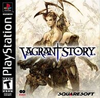 Vagrantstorybox-1210916731.jpg36 KB · Views: 2
 -
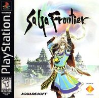 SaGa_Frontier_US_box_art-451706802.jpg32.3 KB · Views: 1
 -
 latest-1265589855.jpg83 KB · Views: 1
 -
 846b856a423e022a31cdd5742a0081e9-278835157.jpg143.9 KB · Views: 3
 -
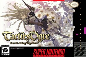 Tactics-Ogre-Let-Us-Cling-Together-1024x683-235988117.jpg135.3 KB · Views: 3
 -
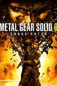 Metal-Gear-Solid-3-Snake-Eater-2262487670.jpg208.2 KB · Views: 2
 -
 Screenshot_20250706_015032_Chrome.jpg109.3 KB · Views: 1
- Joined
- Dec 9, 2024
- Messages
- 109
- Level up in
- 140 posts
- Reaction score
- 238
- Points
- 577
As far as PS1 covers go, the PAL cover of Soul Reaver probably takes the cake imo. The morphing from physical to spectral realm by tilting the cover is a thing of magic.

Other honorable mentions:


Other honorable mentions:
- Joined
- Mar 11, 2025
- Messages
- 209
- Level up in
- 40 posts
- Reaction score
- 436
- Points
- 727
(I prefer the EU boxart for RE4 over the US one, the EU one looks cooler)
- Joined
- Mar 20, 2025
- Messages
- 55
- Level up in
- 44 posts
- Reaction score
- 69
- Points
- 127
- Joined
- Dec 9, 2024
- Messages
- 393
- Level up in
- 106 posts
- Reaction score
- 960
- Points
- 1,477
- Location
- Termina
Ghouls 'N Ghosts (GEN/Mega Drive)

Capcom vs SNK 2 (Dreamcast). This is the full artwork.

Mega Man Zero 3 (GBA)

Two other favorites of mine already mentioned are GCN/Wii Twilight Princess and Majora's Mask's 3DS boxart.
Capcom vs SNK 2 (Dreamcast). This is the full artwork.
Mega Man Zero 3 (GBA)
Two other favorites of mine already mentioned are GCN/Wii Twilight Princess and Majora's Mask's 3DS boxart.
Support this Site
RGT relies on you to stay afloat. Help covering the site costs and get some pretty Level 7 perks too.
Latest Threads
So, about Crash Bandicoot 4...
- Tronky.it
- General Gaming Discussion
- Replies: 0
This is my personal opinion, not perfect and certainly not absolute.
I...
I...
Custom Robo V2 English Beta Patch
- ColonelKurtz
- Fan Translations
- Replies: 0
Can anybody link me to the english beta patch of V2?
It's not posted in the repo. Reddit users...
Read more
It's not posted in the repo. Reddit users...
What Was Some Of Your Favorite Video Game Cover Art?
- Sir Win
- General Retro Gaming
- Replies: 25
Before the Internet, we got our game reviews from friends, magazines, and blind faith judging...
Read more
DSAdvance 1.3
- thecrow2313
- Emulation
- Replies: 1
Release DSAdvance 1.3 · r57zone/DSAdvance
En: Website: https://r57zone.github.io Discord: https://discord.gg/TgnvsfFnt3 Twitter: https://twitter.com/r57zone Telegram: https://t.me/+kdN2a9oy7TNhZTM6 (личный блог на русском языке) Changes: ...
 github.com
AI really gets on my nerves
- Coon
- Videos & Streams
- Replies: 66
I don't know how you all feel about AI but it's really starting to get on my nerves. You almost...
Read more
IRC
- MegaDrive1987
- General Discussion
- Replies: 16
Was wondering if anyone here uses IRC? I know it's a relic but I like my old school internet...
Read more
Which of the 7 Capital Vices Do You Struggle With Most and Why?
- stealthRUSH stealthRUSH
- General Discussion
- Replies: 11
Which of the 7 capital vices do you struggle with most and why? For me it's Sloth - I...
Read more
Online statistics
- Members online
- 111
- Guests online
- 187
- Total visitors
- 298
Totals may include hidden visitors.