Regional box art you like more than the original Japanese version

Glimbo

Final Form
Level 2
Joined
Dec 1, 2024
Messages
235
Reaction score
833
Points
1,227
I always see discussions about the better Japanese boxes but not so much the other way around. I really like the European box art of Shinobi with it's ink look.
shinobij.jpg
shinobie.jpg
 
so yea, i am an odd one, but, love the western release of Mega Man art over the Rock Man art.

22078_front.jpg
megamanbox.jpg


I really want to know where the breakdown in communication was here.

Is it better... no. But is it better, yes, yes it is.
 
Last edited:
I really want to where the breakdown in communication was here.

Is it better... no. But is it better, yes, yes it is.
That one is a classic, alright...
But seriously, in most cases it was simply up to "Paul Marketing" down at corporate. Someone at Konami of Europe looked at Ayami Kojima's beautiful painting of Alucard and said "That's rad, put it on the boxart".
Meanwhile American Paul Marketing looked at it and probably said "THAT DUDE LOOKS LIKE A LADY!"

And that's how it usually went back then...
 
I always see discussions about the better Japanese boxes but not so much the other way around. I really like the European box art of Shinobi with it's ink look.
View attachment 10433View attachment 10434
Totally agree with this one. The western cover looks much more artistic, I really like the bold red color.

While this is a modern game, I like the European cover of Breath of the Wild more than the American/Japanese cover. They're both good in their own right, but I prefer the colorfulness of the European one, and I think it matches the game more overall. The lighting on the Amerucan/Japanese one is really good, but it strikes me as a tad more generic.
botwboxarts.png
 
so yea, i am an odd one, but, love the western release of Mega Man art over the Rock Man art.

I really want to know where the breakdown in communication was here.

Is it better... no. But is it better, yes, yes it is.
That is certainly an interesting choice lol. I did like how they payed homage to it in the Mega Man 9 box art though. They took the concept of it and improved it.
mm9boxart.jpg
 
That is certainly an interesting choice lol. I did like how they payed homage to it in the Mega Man 9 box art though. They took the concept of it and improved it.
View attachment 10477
The one for 10 is EVEN wilder. Giving off some real Doom vibes. Not only is Megaman firing his buster up in the air, he's simultaneously blind-firing a robot in the face with a rifle, and for some odd reason I could only find a small version of the one where Bass is included, all other versions but the Wikipedia cover have him mysteriously scrubbed off.
Megaman10.jpg
 
IMG_3668.jpeg

I feel like the American version of Mario Paint has more life to it than the clinical Japanese variant. I love the little wallpaper bottle things on the desk, the music notes, how happy Mario looks. The logo is bold and exciting!

In the Japanese one, he’s just drawing a derpy looking Yoshi, boring text, mostly white. It’s so drab for a game about creative expression. And the other Japanese variant is also just as uninteresting sadly. I think I would buy the game less if I saw that box art, it isn’t as creative or have that child-like sense of awe and wonder that the American one has (which is more iconic in my opinion).
IMG_3667.jpeg


IMG_3669.jpeg
 
Last edited:
The Silent Hill series always seemed to get more love over at Europe with their boxarts.

It got to a point where I genuinely think they were messing with the American marketing team, because that cover is just goofy as hell. It also doesn't help that the ghost's name is JIMMY.
I like the Europe box art more than the US one but I don't think it beats the Japanese one.
sh4j.jpg
 
I like the Europe box art more than the US one but I don't think it beats the Japanese one.
Well, personally I think every PAL boxart of every classic SH game beats both US and JP out of the water. I get that SH4 JP looks kinda cool but it's still "spooky face on the door" and even if it isn't "Oh damn, Jimmy's at the door again!" it still looks a little silly to me.
I like the imagery of JUST the chained up door with the distorted atmosphere. It conveys the vibes of the game more clearly to me. But hey, opinions right? (y)
 
Its strange to me how the JPN art for the first game is way better but they really fell off the horse for the sequel
If you decide to put your game characters on the boxart, you get two choices:
- Make an artistic 3D render or maybe straight up concept art and make it timeless
- Just say "screw it" and slap the 3D model in there so it looks dated the moment you ship
 
Oh found another one, I seriously dislike the Western Tomb Raider 1 cover, something is off about Lara's model, she looks nothing like herself in later games.

C0SzeKP.png


But in Japan, it's much better, despite Engrish title:

Tombraiders.jpg


I mean, this is literally what you see for most of the game! xD

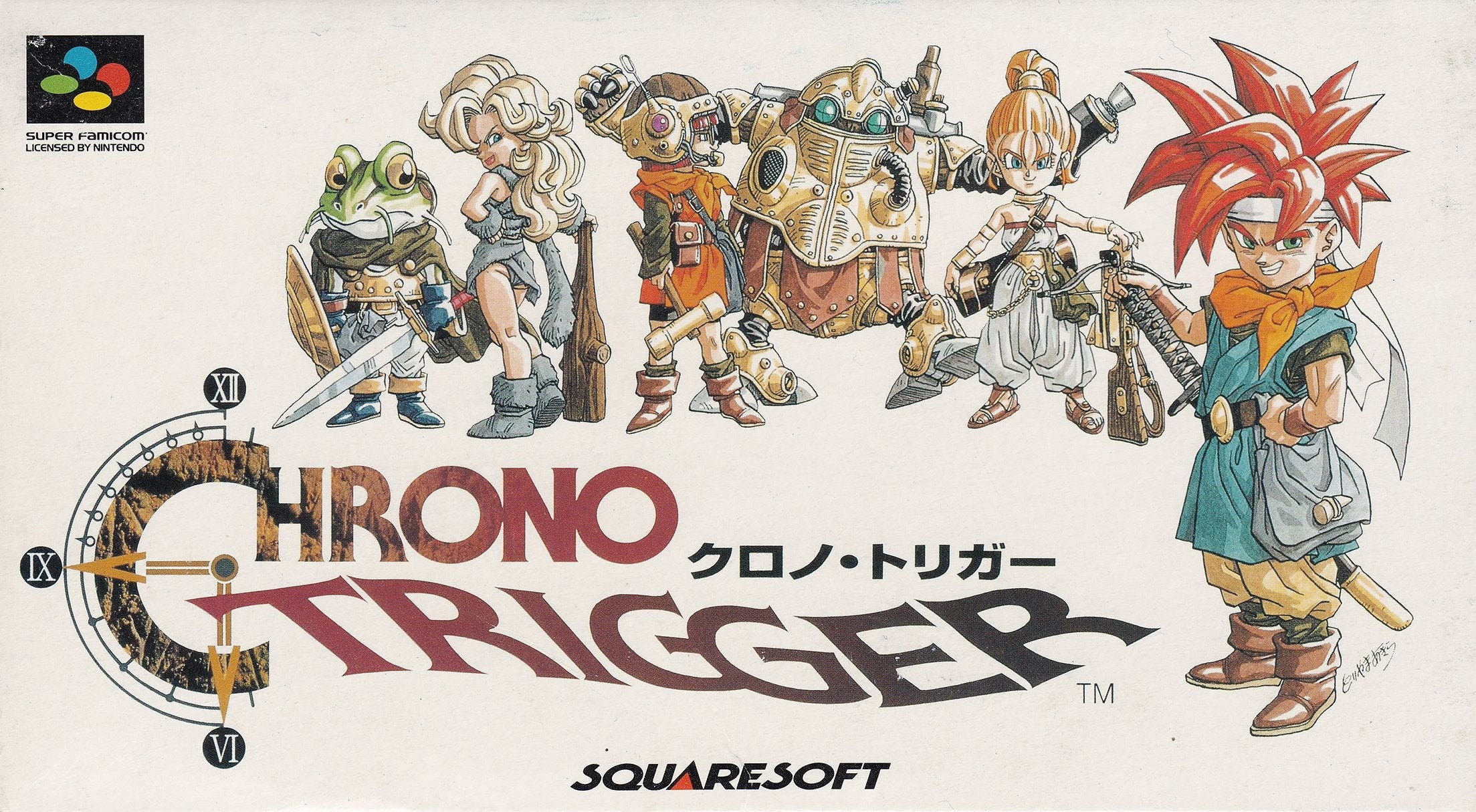
In fact, Japanese covers are just something else, here's someone posting a full collection of Core era games: https://www.reddit.com/r/psx/comments/16nh02e/in_response_to_the_person_who_asked_for_the/

Last Revelation West version looks especially uninspired:

ROAz0qX.png


But Japan shows what she's about to explore instead of focusing on her mug:

rU5t8jR.png


It even extends to manuals, with Japan never missing an opportunity to focus on the... other side:

tr3-japan-ps-manual-1_orig.jpg


Yeah we get it she got milk.

tr3-euro-ps-manual-1_orig.jpg


Finally, American cover of Chronicles channels the spirit of unhinged US Kirby:

wYn4Yzy.png


The European and Japanese covers are both different with a boring face close-up.
 
4306305-final-fantasy-vii-playstation-front-cover.jpg
Final Fantasy VII USA box art is way better and more iconic then the japanese/european box art.
8585656-final-fantasy-vii-playstation-front-cover.jpg
18582703-final-fantasy-vii-playstation-front-cover.jpg

Post automatically merged:

The same applies to Final Fantasy VIII & IX
6144642-final-fantasy-viii-playstation-front-cover.jpg
5382380-final-fantasy-viii-playstation-front-cover.jpg
4471913-final-fantasy-viii-playstation-front-cover.jpg

Post automatically merged:

3958610-final-fantasy-ix-playstation-front-cover.jpg
5577729-final-fantasy-ix-playstation-front-cover.jpg
4382567-final-fantasy-ix-playstation-front-cover.jpg
 
Last edited:
Shadow of the Colossus.
I prefer the EU and US covers over the Japanese one. Personally, I don't know what the Japanese intended to do with that cover. I can't see the colossus clearly. Is the character facing the titan from behind? Or is it a giant robot without a head? I honestly don't know what's going on. Personally, I think the PAL cover is the best.
1736552478433.png
1736552497486.png

1736552515658.png

Post automatically merged:

Also Super Castlevania IV VS Akumajou Dracula
Look at how sick the US cover looks!
1736553082588.png

1736553044861.png
 
Last edited:

Users who are viewing this thread

Connect with us

Latest Threads

Manga Collections

Does anyone else collect manga? Ignore the Lysol wipes lol. I was cleaning at the time. 20250221_122221.jpg
Read more

Voicebank highlights

- Clarifying I’m referring to (Vocaloid, Utau, Synthesizer V, etc)

I’ve inspired to talk about...
Read more

Men in black Chat

I personally enjoy the original 3 movies. Can use this thread to quote lines and
post funny...
Read more

Cloud saves between phone and PC emulators.

Picture it - you’re playing your retro games with enhancements and at high resolution on PC. You...
Read more

Music Artists you discovered through Gaming

Licensed music is often a rare sight in some genres, while being common in others like sports or...
Read more

Online statistics

Members online
181
Guests online
222
Total visitors
403

Forum statistics

Threads
4,845
Messages
114,476
Members
305,349
Latest member
Fenriery

Support us

Back
Top