JP box art of Western games

hazys

Final Form
Level 2
Joined
Dec 10, 2024
Messages
244
Reaction score
377
Points
727
Everyone knows that the original box art of Japanese games is usually superior to the Western counterpart. However, are there Western games that received better, or just more interesting, box art in Japan? I actually don't know too many examples, but I'm curious if anyone else does.

s-l400.jpg


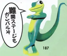
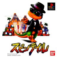
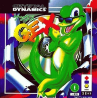
I think Gex is a pretty well-known example, since he looks completely different. I like this goofier Gex though, lol

perfectdark-jp.jpg


The Japanese box art for Perfect Dark is also pretty well-known. It's far more stylish than the Western one.

psiops-j.jpg


Psi-Ops: The Mindgate Conspiracy got an undeniably superior box art in Japan, courtesy of Shinkiro.

ghostrecon-j.jpg


I find the JP cover for Ghost Recon fascinating, not because of the illustration's quality, but because they chose to depict the soldiers relaxing outside of battle, something that you'd never see in a Western release.
 
I actually have a thread about Western box art that's better than the original Japanese version.

Someone in that thread also posted the Japanese box art of Tomb Raider IV which I really liked.
I'm sorry, I hadn't seen your thread. I wonder if they can be merged.

That Gex cover and its completely different character design reminded me of Pandemonium! / Magical Hoppers. (took me ages to remember the names)
Yess, I was thinking of this one but couldn't remember the title(s), either. I think the Japanese designs are more appealing, but the uncanny 3D renders of the Western release are probably more interesting/unique.
 
I'm sorry, I hadn't seen your thread. I wonder if they can be merged.
Nah it's fine, I think they're different enough. Yours is about Japanese box art of Western games and mine is the opposite. I just mentioned it because you were curious about it.
 
I actually have a thread about Western box art that's better than the original Japanese version.

Someone in that thread also posted the Japanese box art of Tomb Raider IV which I really liked.
damn these look much better ::dkapproves
 
I always found the European and Japanese versions of Gex to be kind of weird it seems like they tried to make him cuter and a little more family friendly in the japan.
 

Attachments

  • 9uxk24twrgg81.webp
    9uxk24twrgg81.webp
    25.2 KB · Views: 3
  • 3927_front.jpg
    3927_front.jpg
    37.3 KB · Views: 6
  • liz_media_presents____a_translated_version_of_gex__by_gecko1993_dezhlq3-375w-2x.png
    liz_media_presents____a_translated_version_of_gex__by_gecko1993_dezhlq3-375w-2x.png
    1.1 MB · Views: 6
  • 168000145.png
    168000145.png
    364.5 KB · Views: 6
Wait what the fuck why isn't this the international boxart
1742774286629.png

Post automatically merged:

Ohhhh Limited Run, and apparently it does have that box art everywhere, my fault
 
Originally was not gonna post on this forum, but this topic peeked my interest, and the fact that no one has mentioned this one yet, easily the first example that comes to my mind.

Sudeki, essentially a JRPG that was not actually made by a Japanese studio, pretty sure this was an English studio that also made Silent Hill Shattered Memories later, the American cover art is atrocious.
Sudeki - Box Art - American.jpg


Surprisingly imo, the Japanese version received an entirely different cover art, considering how poorly the first Xbox did in Japan. This cover art is so much better, and makes the original American cover art look like amateur hour.
Sudeki - Box Art - Japanese.jpg
 
Katsuya Terada the Goat himself did the Super famicon cover for Prince of persia.
View attachment 47572
Also shout for Hidari doing a Civ cover.
View attachment 47575
Didn't knew Civ Rev 2+ had a better anime box art used in the Physical versions (in Japan and Asian releases, since USA/EU version didn't get any Physical releases), since the Western one was the cartoony Lincoln from Civ Rev 1 in the app icon (and a mobile port).
 
Future Cop: LAPD, Loaded, Spawn: The Eternal, Jersey Devil, Rascal, Croc: Legend of the Gobbos.

Soukou Kidoutai L.A.P.D.Blood FactorySpawn: The Eternal
Jersey Devil no DaiboukenBubblegun KidCroc! Pau-Pau Island

You have Courier Crisis minimalist blue and red artwork. Tunnel B1 went through a few changes on all three regions. The Horde became cute. I prefer Grid Runner color scheme on the Japanese boxart although Solar Eclipse became worse off in my opinion. Quarantine had name changes as well. Jet Moto looks more like a comic book and Wild 9 like a manga or anime.
Post automatically merged:

Baldies, ClockWerx, Johnny Bazookatone, Mr. Bones, Mass Destruction, Star Fighter

Baldy LandClockWerxJohnny BazookaMr. Bones5020_front.jpgStarFighter 3000

Then you have Shellshock minimalist black and red silhouettes. MechWarrior 2 with the stage present in the background. Total Eclipse Turbo alien on the cover. Creature Shock has an interesting render of a monster.
 
Last edited:

Users who are viewing this thread

Connect with us

Latest Threads

[RGT] Definitive Character Megathread

20250312_144011 (1).jpg


I made this thread as a celebration of all characters, from all...
Read more

Time to Talk Time Crisis

1742925855659.png

This isn't my copy, but I bought the same boxed-edition that came with the...
Read more

Top 10 Rpg's?

Could be Western rpgs, Jrpg's but what is your top 10?

10. Quest for Glory So you Want to be...
Read more

Character with executioner name.

Hello.
in video games there are always some characters or enemies with this names...
Read more

Post/reminisce over cool/weird/obscure/stupid preorder bonuses and collectors' editions

The CoD CE with a canteen that actually couldn't function as a canteen. The infamous Witcher 2...
Read more

Online statistics

Members online
205
Guests online
200
Total visitors
405

Forum statistics

Threads
5,762
Messages
141,315
Members
352,913
Latest member
bartali

Support us

Back
Top