You are using an out of date browser. It may not display this or other websites correctly.
You should upgrade or use an alternative browser.
You should upgrade or use an alternative browser.
[Game Design] why games don't put button prompts by their place instead of the button itself?
- Thread starter Ikagura Ikagura
- Start date
- Joined
- Jan 10, 2025
- Messages
- 2,684
- Level up in
- 2316 posts
- Solutions
- 2
- Reaction score
- 14,343
- Points
- 6,077
- Location
- Overworld
I'm sure it's a conveyance thing some UX designer focus-tested the heck out of, but I definitely prefer the way it looks in that Revengeance screenshot.
Feels like it makes me react to where I'm supposed to press like a frame or two faster.
Feels like it makes me react to where I'm supposed to press like a frame or two faster.
- Joined
- Dec 3, 2024
- Messages
- 5,460
- Reaction score
- 7,731
- Points
- 10,977
Revengeance is a fast paced game that understood everything.I'm sure it's a conveyance thing some UX designer focus-tested the heck out of, but I definitely prefer the way it looks in that Revengeance screenshot.
Feels like it makes me react to where I'm supposed to press like a frame or two faster.
I wish the Batman Arkham games did the same...
- Joined
- Oct 26, 2024
- Messages
- 2,109
- Level up in
- 391 posts
- Reaction score
- 5,978
- Points
- 3,577
- Location
- Puerto Rico
its probably one of those subjective things where you ask 100 people and 50 prefer left and 50 prefer right.
- Joined
- Nov 13, 2024
- Messages
- 2,364
- Level up in
- 136 posts
- Reaction score
- 8,257
- Points
- 3,577
- Location
- Megaman X2
Personally, I'm a fan of the way older systems like the NES handled tutorials

- Joined
- May 30, 2025
- Messages
- 2,567
- Level up in
- 2433 posts
- Reaction score
- 4,870
- Points
- 5,977
Imagine needing a tutorial for such simple games that have very few buttons. I can imagine a world where there is no country and war easier!!!! lololPersonally, I'm a fan of the way older systems like the NES handled tutorials
View attachment 123899
Back in ma day we would explore each game we play, test waters and all to discover what we can do and what kind of features the game have. Since I was always a pirate gameaaaarrr the NES and Sega Genesis games I bought wouldn't come with a paper tutorial (and even if it had I didn't know English and Japanese back then so it would only be worth as much as a toilet paper for me lol).
And my bro plays games without any of such way of gaming, he doesn't even check keybinding in games and shit so my dude played the whole Silent Hill series without having any idea you can run ayy lmao.
In this context on-screen tutorial becomes a necessity, and showing gamepad layout instead of just a button actually matters when you are new to the console you are playing (for example I rarely play Nintendo games so I still couldn't get used to their button layout lol). And it's da shit when Japanese games on PC using XBOX button visuals that I also mix them up which is which. We should establish the World Gamer Organization (WVGO) and enforce video game companies to use standard symbols for buttons. Fuck the way they all come up with their different symbols, I ain't gonna memorize button layouts for every console they come up with!!! #MakeVideoGamingGreatForOnce!!!! lolol
- Joined
- Oct 2, 2024
- Messages
- 1,518
- Level up in
- 982 posts
- Reaction score
- 6,213
- Points
- 3,477
ux, not game design
to amuse myself I'll just drop the question:
if I'm asking you to press a button, why would I should you buttons that you should not press?
thisits probably one of those subjective things where you ask 100 people and 50 prefer left and 50 prefer right.
to amuse myself I'll just drop the question:
if I'm asking you to press a button, why would I should you buttons that you should not press?
Last edited:
- Joined
- Jan 10, 2025
- Messages
- 2,684
- Level up in
- 2316 posts
- Solutions
- 2
- Reaction score
- 14,343
- Points
- 6,077
- Location
- Overworld
Izall game design maangux, not game design

The feeling is really fresh in my mind because when I was playing Shenmue the other day I messed up a bunch of QTEs because the buttons being isolated makes for some weird disconnect for me where I reflexively have to look at the controller so it's probably some sort of conveyance thing. It might be more prevalent in multiplatform games.if I'm asking you to press a button, why would I should you buttons that you should not press?
Not sure what causes it but I assumed it was that, I never ever have to look at my controllers otherwise.
When playing Dark Souls on Switch I constantly rolled off cliffs when trying to pick up items, because the game is so much muscle memory, but when the in-game graphics say [B: Pick up item] I press A on the Nintendo controller which is the roll button, but somehow the in-game graphics came before me knowing what controller I was holding, and I kept doing it throughout the ENTIRE playthrough.
- Joined
- Oct 2, 2024
- Messages
- 1,518
- Level up in
- 982 posts
- Reaction score
- 6,213
- Points
- 3,477
Now we are diving into muscle memory, different platforms. That's a tough one to crack but showing all buttons and highlight the position solves this, for the most part.Izall game design maang
The feeling is really fresh in my mind because when I was playing Shenmue the other day I messed up a bunch of QTEs because the buttons being isolated makes for some weird disconnect for me where I reflexively have to look at the controller so it's probably some sort of conveyance thing. It might be more prevalent in multiplatform games.
Not sure what causes it but I assumed it was that, I never ever have to look at my controllers otherwise.
When playing Dark Souls on Switch I constantly rolled off cliffs when trying to pick up items, because the game is so much muscle memory, but when the in-game graphics say [B: Pick up item] I press A on the Nintendo controller which is the roll button, but somehow the in-game graphics came before me knowing what controller I was holding, and I kept doing it throughout the ENTIRE playthrough.
- Joined
- Dec 4, 2024
- Messages
- 1,574
- Level up in
- 926 posts
- Reaction score
- 4,193
- Points
- 3,577
- Location
- Nowhere
Give more of left please, my chicken brain always gets nervous and press the wrong button in the heat of the QTE, especially in Paper Mario
- Joined
- Feb 10, 2025
- Messages
- 729
- Level up in
- 271 posts
- Reaction score
- 3,247
- Points
- 2,477
- Location
- The Bone Zone
Because the second a QTE pops up, I will absolutely forget the position of every button on my gamepad. Please be nice to the memory challengedif I'm asking you to press a button, why would I should you buttons that you should not press?

- Joined
- Oct 2, 2024
- Messages
- 1,518
- Level up in
- 982 posts
- Reaction score
- 6,213
- Points
- 3,477
Because the second a QTE pops up, I will absolutely forget the position of every button on my gamepad. Please be nice to the memory challenged
- Joined
- May 30, 2025
- Messages
- 2,567
- Level up in
- 2433 posts
- Reaction score
- 4,870
- Points
- 5,977
Video games constantly showing whole button layout instead of just the button matters more in this idiotic times and retard ages because retarded video game companies using the same letters for differently positioned buttons like Xbox's X, Y, A, B buttons are too differently placed compared to Nintendo's X, Y, A, B buttons so you can mix shit up during quick reflex actions SMH. Fucking professional idiots lol.
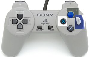
For me PlayStation buttons makes sense the most and their symbols actually indicates a general logic of function. Circle means "okay", Cross means "cancel", Square means "action" and Triangle means "upper or switch" so the functions makes sense in PlayStation games even though you didn't play the game before, but for me A, B and X, Y means shit. My brain only makes sense them in the context of "A and B are main function buttons" and "X and Y are secondary function buttons" but the letters itself mean shit about what action they do SMH.
For me PlayStation buttons makes sense the most and their symbols actually indicates a general logic of function. Circle means "okay", Cross means "cancel", Square means "action" and Triangle means "upper or switch" so the functions makes sense in PlayStation games even though you didn't play the game before, but for me A, B and X, Y means shit. My brain only makes sense them in the context of "A and B are main function buttons" and "X and Y are secondary function buttons" but the letters itself mean shit about what action they do SMH.
Cross should have been Hexagon.
- Joined
- Jan 10, 2025
- Messages
- 2,684
- Level up in
- 2316 posts
- Solutions
- 2
- Reaction score
- 14,343
- Points
- 6,077
- Location
- Overworld

Or maybe a pentagon. No sides, three sides, four sides, five sides.
- Joined
- Dec 1, 2024
- Messages
- 2,159
- Level up in
- 341 posts
- Reaction score
- 4,277
- Points
- 3,477
- Location
- Villa Villekulla
It's funny. I can convert PSX shapes to Xbox layout in my head on the fly, but getting me to get ABXY right on a Nintendo system the first time? Forget it
- Joined
- Dec 3, 2024
- Messages
- 5,460
- Reaction score
- 7,731
- Points
- 10,977
Thanks to Sony inverting the functions of X and O depending if you're in the west or in Japan didn't help.
Blame me using the X360 pad which makes me double check for X and Y (whereas A and B is easier to handle).It's funny. I can convert PSX shapes to Xbox layout in my head on the fly, but getting me to get ABXY right on a Nintendo system the first time? Forget it
I notice how the Xbox pad layout are taken straight from the Dreamcast's:
- Joined
- Jan 10, 2025
- Messages
- 2,684
- Level up in
- 2316 posts
- Solutions
- 2
- Reaction score
- 14,343
- Points
- 6,077
- Location
- Overworld
This was insanely confusing, especially since the buttons are the same as Xbox, but not the colors.Thanks to Sony inverting the functions of X and O depending if you're in the west or in Japan didn't help.
Blame me using the X360 pad which makes me double check for X and Y (whereas A and B is easier to handle).
I notice how the Xbox pad layout are taken straight from the Dreamcast's:
View attachment 123983
Joke controller aside, I much prefer a no quick time event design and have the game implement a "one button is one function". Combining functions to create more functions is fine. So long as a single button is not used for multiple functions such as being both the Jump and Interaction.
The exception being if the game uses contextual prompts where jumping is only allowed when interacting with specific in-game objects. In which case the button still performs the single function of interaction.
If a game feels the absolute need to include quick time events, or happens to be a rhythm game, I'd prefer if the button labels were left off and the game just showed a diagram with the correct button or buttons highlighted.

**edit**
Joysticks and motion controls should never be used in quick time events, they are just not accurate enough.
The exception being if the game uses contextual prompts where jumping is only allowed when interacting with specific in-game objects. In which case the button still performs the single function of interaction.
If a game feels the absolute need to include quick time events, or happens to be a rhythm game, I'd prefer if the button labels were left off and the game just showed a diagram with the correct button or buttons highlighted.
**edit**
Joysticks and motion controls should never be used in quick time events, they are just not accurate enough.
Memorizing like cardinal points on a compass can help.
- Joined
- Oct 9, 2024
- Messages
- 461
- Level up in
- 39 posts
- Solutions
- 1
- Reaction score
- 884
- Points
- 1,477
I am fairly sure it has to do with history and limited screen real estate, that is, how big something has to be in 240p and 480i times to be legible. Back then big buttons with the color were likely easier to put on the screen without filling too much of it.
Of course, now, in HD age you can do what Switch is doing on most platforms and few games, thanks to that direction have been doing Switch like input directives.
Of course, now, in HD age you can do what Switch is doing on most platforms and few games, thanks to that direction have been doing Switch like input directives.
- Joined
- Oct 4, 2025
- Messages
- 35
- Level up in
- 65 posts
- Reaction score
- 51
- Points
- 127
The Revengeance screenshot looks good, but in general I don't trust developers to not fuck it up and clutter up the screen too much. Just showing the exact button you need to press on the screen is cleaner than also showing all the ones you *don't* need.
For fighting game move lists Tekken will forever be King for me for illustrating where the buttons you need to press for the combos etc. are.

For fighting game move lists Tekken will forever be King for me for illustrating where the buttons you need to press for the combos etc. are.
- Joined
- Dec 30, 2024
- Messages
- 942
- Level up in
- 58 posts
- Solutions
- 1
- Reaction score
- 4,466
- Points
- 2,577
Ah, my favorite console controller, the XboxGameCubeSuperFamicomPlayStation controller.I prefer the left version simply because I no longer know where "X" is any more.
Users who are viewing this thread
Total: 7 (members: 6, guests: 1)
Support this Site
RGT relies on you to stay afloat. Help covering the site costs and get some pretty Level 7 perks too.
Featured Video
Latest Threads
BOO!
- OPT1MUS
- General Discussion
- Replies: 2
HAPPY HALLOWEEN! 
To the "AI-phobics and unbelievers"...

...and to all the...
Read more
To the "AI-phobics and unbelievers"...
...and to all the...
Sega Rally Championship (CPBC's Audio Remake) [Saturn]
- I R O N
- Romhacks Releases
- Replies: 0
Yup! I did it. This is a Remake of the OST for Sega Rally. I didn't go crazy with it and tried...
Read more
Happy Samhain
- Retro Doomer
- General Discussion
- Replies: 12
I wish you all a fine Samhain today.But I probably will not be that active here todays as I...
Read more
[Game Design] why games don't put button prompts by their place instead of the button itself?
- Ikagura Ikagura
- General Gaming Discussion
- Replies: 26
Something like this

And

Read more
And
Online statistics
- Members online
- 120
- Guests online
- 559
- Total visitors
- 679
Totals may include hidden visitors.